Solarpunk Optimist
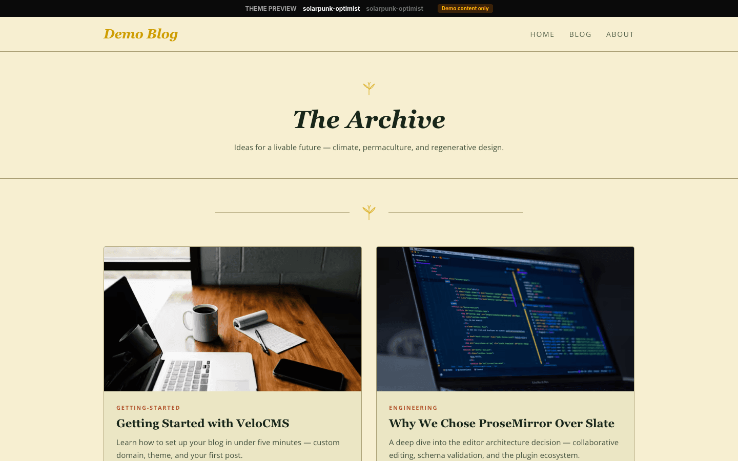
Cream paper, moss and terracotta, and small line-drawn sprouts that recur on every page.
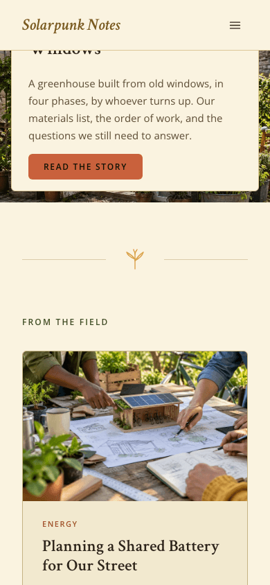
Solarpunk Optimist turns your newest post into the cover of the site. Its picture fills a wide 16:9 hero, and a cream card in the lower corner carries a gold ribbon drawing, the post's first tag, its title, its excerpt then a Read the story button. Four more posts follow, two to a row on straw-coloured cards, set apart from the hero by a small gold sprout set between two hairlines.
Who it's for
Its natural readers write about repair rather than doom: sustainability and climate bloggers, permaculture and allotment gardeners, urban growers, community groups and authors of hopeful environmental fiction. The sample wording leans the same way, with a From the Field label over the home grid. Because the shop uses the same straw cards and serif italics, a garden collective or small press can sell seeds, zines or guides without a change of look. Look elsewhere for a dark site, a dense news front page or a video hero.
What makes it different
One family of line drawings across the site
The ornaments are inline single-stroke drawings rather than image files. A gold ribbon of two leaves tops the hero card, the shop title and the mobile drawer; a growing sprout marks the home divider and the middle of every footer; a leaf appears in the corner of a home card on hover; a woven basket labels the drawer's cart row.
Fills the gaps before you have pictures
A post without an image does not leave a blank tile. Home cards cycle through four diagonal blends of terracotta, moss, gold and straw, the hero falls back to a terracotta wash, and an article without a cover gets a green-to-orange sweep. Before your first post, a sample rooftop-farm story and four placeholder cards hold the layout.
A calm reading column
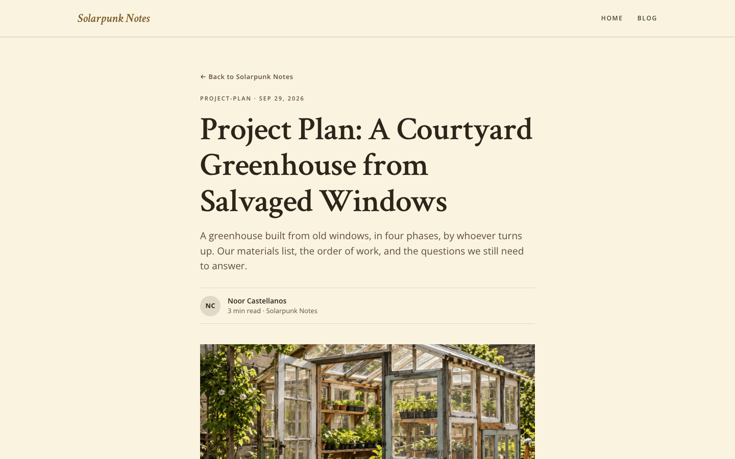
Articles sit in a 720px column: a link back to the blog, a tag and date line, a large serif headline, the excerpt as a standfirst, a byline that circles the author's initials beside the reading time, then a 16:9 cover. Tags under the text open the filtered blog, and comments close the page.
A terracotta Subscribe pill and an end-of-article box
Signed-out visitors get a terracotta Subscribe pill in the header and a matching button in the mobile drawer, and every article closes on an email box, provided you run a newsletter or membership and have switched on Show subscribe widget on blog. That form opens your subscribe page rather than signing readers up directly.
A market stall in the same paper
The shop opens under a gold ribbon and an italic title, and shoppers can search, pick category chips that turn terracotta when chosen, set a price range or tick in-stock only. Each card carries a 4:3 picture, which may crossfade to a second on hover, a moss category line, an italic name, a short description and the price.
Product pages that lead with the price
A product page starts with a straw panel holding the italic title, tagline, price and buy buttons, followed by the widescreen 16:9 gallery and its thumbnails, an About this product block, a What's included checklist and collapsible questions and answers. Further down, a second buy band offers the buttons again.
Page by page
- Home
- The newest post as a 16:9 cover with a ribbon card, a sprout divider, two columns of straw cards (four in all) and a three-part footer.
- Blog
- A heavy sans-serif heading with your site name, pill filters for categories, cards three to a row with reading times, and page numbers.
- Post
- Narrow 720px reading column: initials byline, 16:9 cover, clickable tags, an optional email box, then comments.
- Page
- Small label, serif heading and standfirst, with page-builder blocks below in that same narrow column.
- Shop
- Ribbon-topped title, a search field, category chips, filters for price and stock, and product cards that wrap to fit the screen.
- Product
- Title and price panel first, then gallery, description, the What's included checklist, a repeat buy band and an accordion of questions.
Customizing it
Once Apply my brand to the whole site theme is on in Global Design, the cream background, soil-brown text, muted text and hairline borders take your colours. Your primary colour replaces terracotta on buttons, tag lines and shop prices; your accent replaces moss on menu links, section labels and the drawer. The serif and the sans give way to your heading and body fonts. A new background shifts the straw cards and footer too. Several shades stay fixed: the gold ornaments, the dark gold of the site name and shop titles, and the hemp borders on home cards.
Honest limits
- There is no dark version: the palette stays light whatever colour scheme a visitor's device prefers.
- Five posts is the ceiling on the home page, the hero plus four cards; anything older lives on the blog page.
- The hero always shows your newest post. It uses the site hero image or that post's picture, but it cannot play a video, and no setting lets you write your own headline for it.
- The theme reads no Theme Copy fields, and a few labels are fixed in English regardless of site language: Featured on an untagged hero post, All and Next on the blog page, the comment count and What's included on product pages.
- The body text asks for Open Sans, which the theme does not load, so most visitors see their system sans-serif. The home and blog pages have no search box, since only the shop has one, and shop cards have no wishlist button.
Specifications
- Category
- Sustainability
- Price
- Included
- Plan availability
- Included in every VeloCMS plan
- Commerce-ready
- Yes
- Motion
- No
Frequently asked questions
Which post becomes the big picture on the home page?
Always the newest one. Its first tag becomes the small terracotta label, and its title and excerpt fill the cream card. The picture comes from the hero image in your site settings if you have set one, otherwise from the post itself, and otherwise the hero shows a terracotta wash.
Does anything move on the page?
Very little. Nothing animates on load. Links change colour, home cards turn their border moss and reveal a small leaf, and blog cards lift by two pixels. The menu drawer simply appears, without a slide. When a visitor has asked for reduced motion, a site-wide rule makes these changes instant instead of animated.
Can menu items have sub-items?
Yes. On desktop, a parent item's children open in a cream panel with gently rounded corners. On screens narrower than 1024px, a drawer at most 320px wide opens from the end-of-line side, mirroring correctly in Arabic, with the sub-links shown open and indented.
Can I sell seeds, prints or downloads with it?
Yes, it ships with its own shop and product pages. Add to Cart shows up after you connect Stripe or PayPal; products with variants send buyers to their own page to choose; and the instant-delivery second buy button needs Stripe connected.