Wabi Sabi
Slow writing on warm paper: ink, one terracotta note, and room to breathe.
Wabi Sabi borrows its manners from Japanese restraint. The page is warm paper, the text is near-black sumi ink, and terracotta appears only where it must. Headings are set in Cormorant Garamond, the navigation is plain words divided by small dots, and the reading column sits a fifth of the way in from the left, with a deliberate gap before the list begins.
Who it's for
It suits writers who would rather be read than noticed: mindfulness and slow-living essayists, ceramic artisans, tea and meditation teachers, minimalist bloggers and anyone publishing a quiet journal. A handful of products can sit comfortably in its shop. It is not the theme for a busy magazine, a feed of many small posts, or a brand that needs bold colour and motion, because nothing here is designed to compete for attention.
What makes it different
An offset column and a held breath
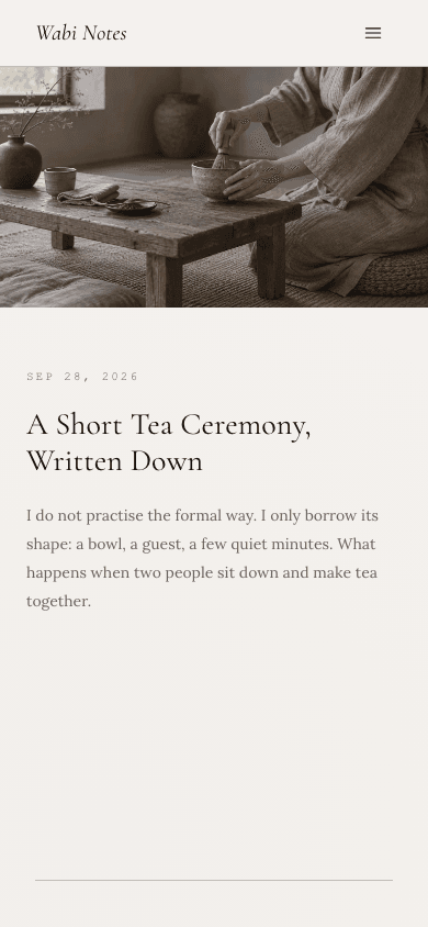
The home page opens on one wide landscape picture, then the newest post's date, title and excerpt in a narrow column pushed a fifth of the way across the screen. A 240-pixel pause and a hairline rule follow before the rest of your posts appear. On screens under 880 pixels the offset falls away.
A plain list instead of cards
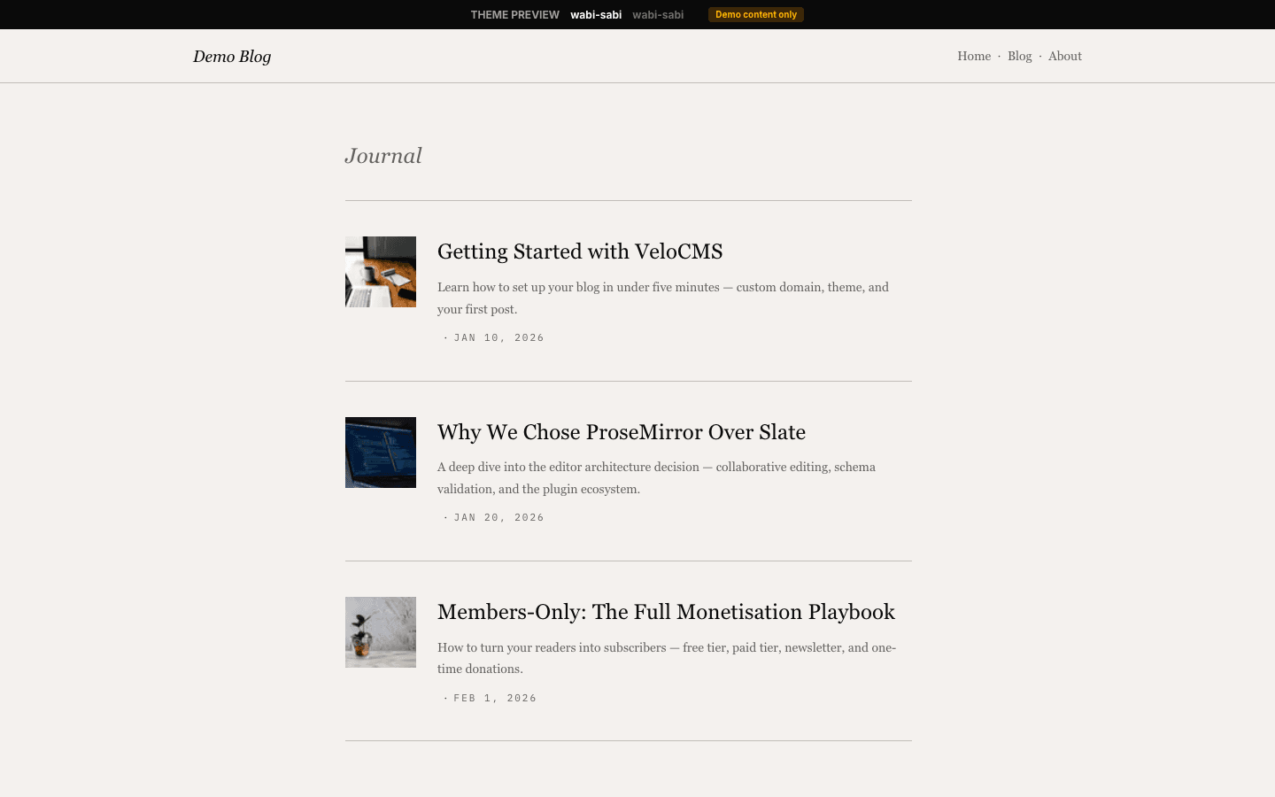
After the opening post, every other entry is a title, an excerpt and a small date, separated by thin rules. There are no thumbnails, badges or counters. Reading flows downward in one column, and the only decoration is the footer's three-dot ornament above your name and tagline.
A blog index with quiet filters
The blog page names the archive in a small label, repeats your site name as its heading and shows your description beneath. Category filters appear as slim pills, and posts sit in a card grid that drops from three columns to two and then one, with numbered pages and Previous and Next links.
Essays with room around the prose
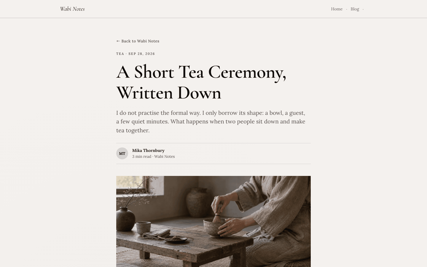
A post begins with a link back to the blog, then a tag and date line, a large serif title and an italic summary. An initials badge and a read-time line introduce the author, a wide cover follows, and tags, a short newsletter invitation and comments close the entry.
A shop that reads like a catalogue list
Products are rows, not tiles: a small muted thumbnail, an uppercase category, an italic title, a one-line description and the price in terracotta. A hairline search field, category links, price range and an in-stock checkbox sit above. A second image appears on hover, and a cart button follows when payments are live.
Product pages without clutter
The product page opens with a link back to the shop, an italic title, an optional tagline and the price beside its buttons. The gallery comes below, then a short about section, a feature list divided by hairlines and any questions you added, folded into a simple accordion.
Page by page
- Home
- Wide picture, offset column with the newest post, a deliberate gap, then a hairline-separated list and a centred footer.
- Blog
- Archive label, site-name heading, filter pills, a responsive card grid and numbered pages with Previous and Next links.
- Post
- Back link, tag line, serif title, italic summary, byline, wide cover, prose, tag pills, newsletter note and comments.
- Page
- Eyebrow, serif title and a short intro above a prose column for About pages and the like.
- Shop
- Search, category links and price filters above a spacious list of single-line product rows.
- Product
- Italic title and price, buttons, gallery, about text, feature list and an FAQ accordion.
Customizing it
Global Design reaches the page ground, the ink colour, the terracotta accent, the supporting grey and the border tone, and your own heading and body fonts take over from the defaults. The cream surface tone and the faintest greys stay fixed. Unlike several sibling themes, Wabi Sabi has no Theme copy slots, so its small interface wording is edited only through the language files, not in the admin.
Honest limits
- Light only. The stylesheet defines one paper palette and does not react to a visitor's dark-mode setting.
- There are no editable wording slots. Labels such as Next, Notes, Keep reading and the footnote New notes weekly in the mobile menu come from the translation files and cannot be rewritten from Settings.
- The newsletter box under each post carries a fixed sentence, One short email a month, never more, whatever your real sending schedule is, and the comment count words are English only.
- With no site description, the footer and the empty home hero fall back to the line Slow writing for quiet minds, and a missing site name falls back to Wabi Sabi. The wide gap under the hero keeps its full height on narrow screens.
- No video or scroll motion. The hero is a still picture; only hover transitions (colour, border and a two-pixel lift on blog cards) and the slide-in menu move, so it will not suit a site that wants a cinematic opening.
- The home page shows your newest post as the hero, so a very short archive looks sparse. The reading-column offset is fixed at a fifth of the width above 880 pixels, with no setting to centre it.
Specifications
- Category
- Mindful
- Price
- Included
- Plan availability
- Included in every VeloCMS plan
- Commerce-ready
- Yes
- Motion
- No
Good fit for
Frequently asked questions
Can I show a hero image that is not my latest post?
Yes. Set a hero image in your site settings and the home page uses it as the wide picture. Without one, the cover of your newest post is used, and if neither exists you get a plain tinted block.
Does Wabi Sabi support dropdown menus?
Yes. A top-level link that has children opens as a dropdown on desktop. In the slide-in mobile menu, which glides in from the reading-end edge and is safe for right-to-left layouts, the links are set in quiet italic serif lines.
Can I sell more than a few things?
You can, since the shop is searchable and filterable by category, price and stock. The single-line rows suit a curated range better than a large catalogue, where a denser grid would help shoppers scan.
How do I get a subscribe link into the layout?
Switch on newsletter signup or membership. A Subscribe link then appears in the header, the footer, the mobile menu and at the end of each post. With signup off, none of those places show it.
Which languages and directions does it handle?
English and Arabic both render, with the mobile drawer written to flip for right-to-left. Interface wording comes from the translation files, and your own posts are in whatever language you write them.