Memo Garamond
A contents page for your research: serif type, a green rule and no pictures up front.
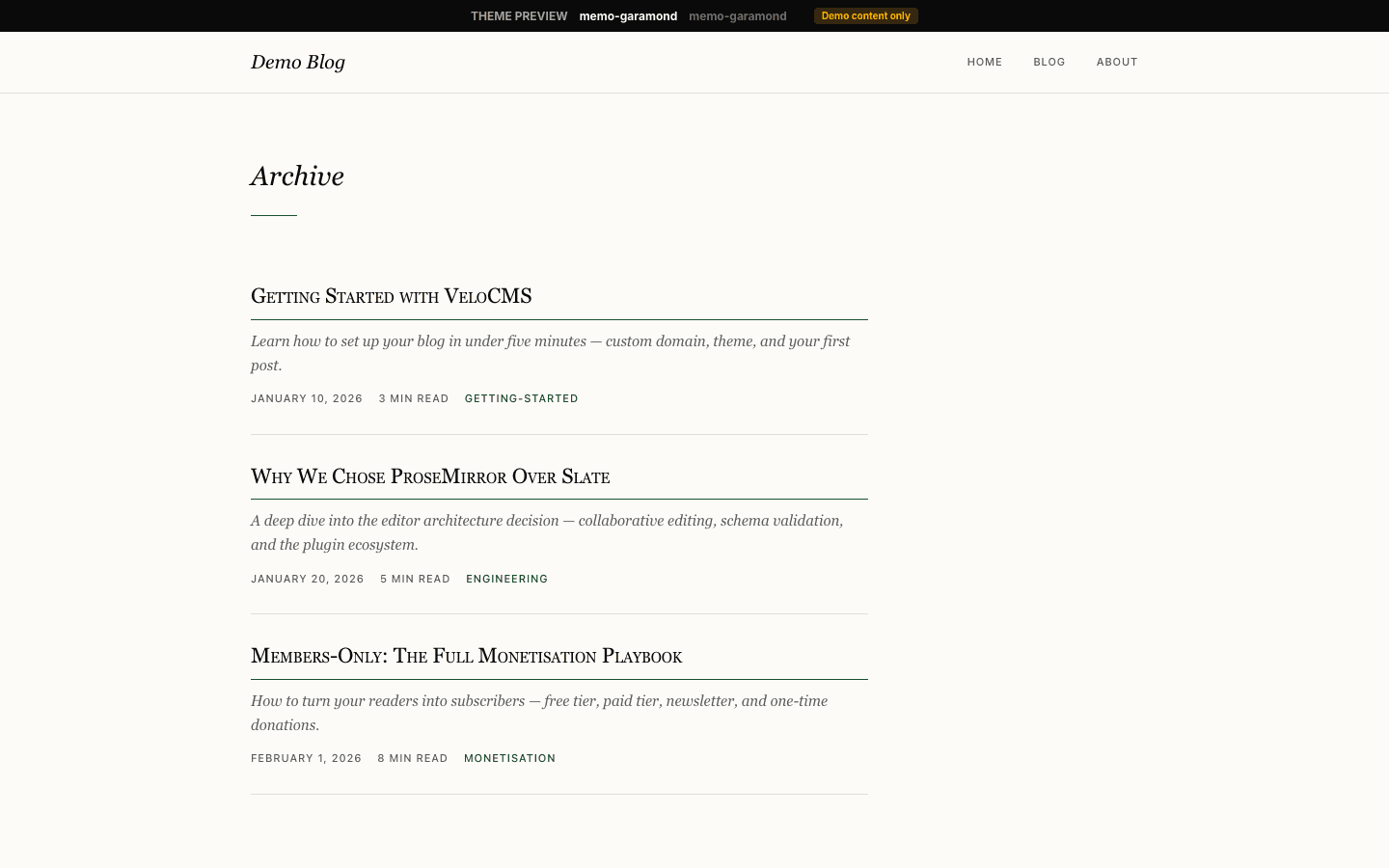
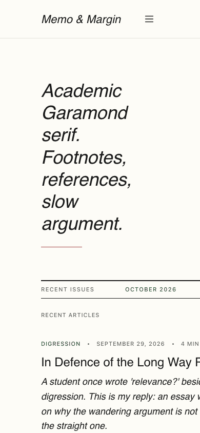
Memo Garamond sets a research blog like the contents page of a small journal. The home page has no hero image: your site description becomes a large italic headline over a thin green rule, followed by an issue line and your four latest articles as plain text entries, each title closed by a small superscript number. On wide screens a narrow margin column carries three short editorial notes.
Who it's for
It suits people for whom the writing is the whole point: academics publishing working papers and essays, scientists explaining their field, policy researchers, historians and long-form essayists who cite their sources. The front page gives every article equal weight and no thumbnails, so a site with few photographs loses nothing. If your work is visual, or you want a dark palette or a home page showing more than four recent pieces, choose another theme. The margin notes speak in a journal's voice about readers' letters and a monthly email, and their wording cannot be edited.
What makes it different
Typographic contents instead of cards
The home page lists your four newest posts as text alone. Each entry carries the first tag in green, the date and reading time in small sans-serif uppercase, a serif title ending in a superscript numeral from 1 to 4, an italic excerpt and the author's name. Past four posts, a View full archive link follows.
An issue line and three margin notes
Above the list, a ruled line reads Recent Issues, the current month and year in green, and how many articles are shown. On screens 1100 pixels or wider, a 200-pixel column beside the list holds three italic notes headed In this issue, From the editor and Subscribe, each edged by a hairline.
A drawer that reads like a table of contents
Below 1024 pixels the menu moves into a 320-pixel panel anchored to the end edge of the line, so it opens from the left on Arabic pages. A Contents label and a short green bar head a list of large italic links. Sub-items sit expanded and indented under their parent, while desktop dropdowns open in a panel with 2px corners.
Subscribe prompts that stay quiet until needed
Once a newsletter or membership is configured and the subscribe widget setting is on, a dark Subscribe button joins the header for signed-out readers, the mobile drawer gains a green Subscribe block, and each article gets a Keep reading box after its tags whose email field signs readers up in place.
A catalogue without pictures
The shop keeps the same rule. Products form a ruled list with a green category label, an italic title, the first 110 characters of the description and a green price, beneath a centred search field drawn as a single underline and a row of category links. Variant-free products gain an add-to-cart button once a payment method is connected.
Product pages set as a single column
A product page is one 720-pixel column: a back link, a small kicker taken from the product's tagline, an italic title, a short green rule and the price. Below come the description, an italic feature list split by hairlines and a collapsible question list. An Instant digital delivery link appears when Stripe is connected and stock remains.
Page by page
- Home
- Italic headline from your site description, an issue line, four numbered text entries and, on wide screens, three margin notes.
- Blog
- Site name, description, category pills and a grid of picture cards, three across on wide screens, with page numbers and a Next page link.
- Post
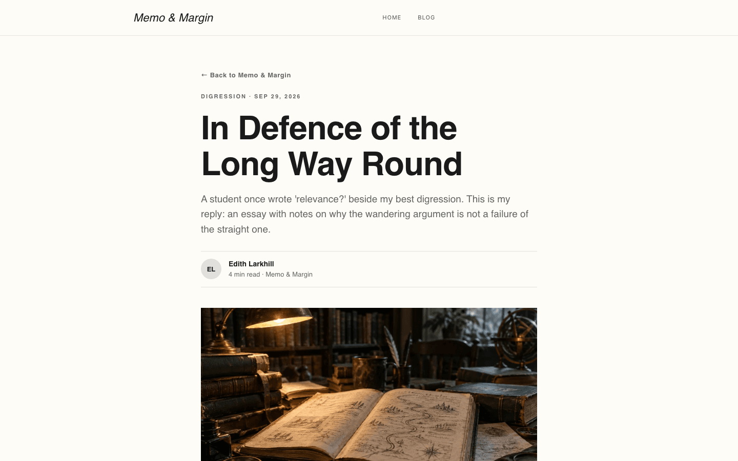
- Serif title, the excerpt as a standfirst, an initials byline, a 16:9 cover, 18px prose, plain tag labels and comments.
- Page
- A small eyebrow, a serif title and a grey description above your page content in a 720-pixel column.
- Shop
- Centred italic title, an underlined search field, category links and an image-free product list with green prices.
- Product
- Back link, italic title, green price, add-to-cart, description, feature list and FAQ, with no photo or gallery.
Customizing it
Switch on Apply my brand to the whole site theme in Global Design and Memo Garamond adopts your background, text colour, and a legible shade of your secondary colour for muted labels. Your primary colour replaces the forest green on rules, prices and add-to-cart buttons, and a legible shade derived from it takes over the green wording. Heading and body fonts you choose replace the serif. Your neutral colour is not used, and borders, the hover tint, faint dividers, lighter hover green, sans-serif label face and 2px corners stay fixed.
Honest limits
- Light only. The stylesheet defines one cream palette and has no rule that follows a visitor's dark-mode setting.
- The home page shows just the four most recent posts and no post or hero images; the hero image setting is ignored there. Older work is reached through View full archive or the blog page.
- Only the home page is strictly typographic. The blog index is a grid of rounded picture cards, and a post without an image leaves an empty picture area on its card.
- Articles have no sidenotes; the margin column is home-page only. Its three notes, the drawer line New notes each week and the login and subscribe eyebrows are fixed text, with no Theme Copy fields. The Subscribe note promises a monthly email even without a newsletter.
- Product photographs are left out of the shop list and the theme's product body, so buyers never see a product's main image or gallery there. Article tags are plain labels rather than links.
- The stylesheet requests its serif by family name rather than the copy the platform bundles, so unless you choose your own fonts in Global Design, readers see EB Garamond only if it is installed on their device and otherwise a fallback serif such as Palatino or Georgia.
Specifications
- Category
- Academic
- Price
- Included
- Plan availability
- Included in every VeloCMS plan
- Commerce-ready
- Yes
- Motion
- No
Frequently asked questions
Can I write footnotes in the margin of an article?
Not through the theme. The narrow notes column appears only on the home page, on wide screens, and its entries are fixed. Article text runs in a single column, so put notes in the body, for example as a numbered list at the end.
Why does the home page have no pictures?
That is the design: the home layout skips the hero image and lists posts as text. Covers still appear on blog index cards and atop each article; the shop list and product body show none.
Can I sell books, papers or course notes?
Yes. Memo Garamond ships its own shop and product pages. When commerce is enabled, a Cart link with an item count appears in the header and drawer. Add-to-cart buttons show only after a payment method is connected, and products with variants open their own page for choosing an option.
Does anything move on the page?
Very little. Nothing plays on its own; links and rows change colour on hover, blog index cards rise 2 pixels under the pointer, and desktop dropdowns fade in briefly. The shared menu drops its fade for visitors who ask for reduced motion, but the theme's stylesheet has no such rule, so the card lift stays.
How are nested menus handled?
On desktop, an item with children opens a compact italic dropdown with 2px corners. In the mobile drawer each child sits beneath its parent, indented and already open, so readers see the whole outline at once.