Atelier Modern
Warm ivory, a large Garamond headline and an off-balance bento of recent work.
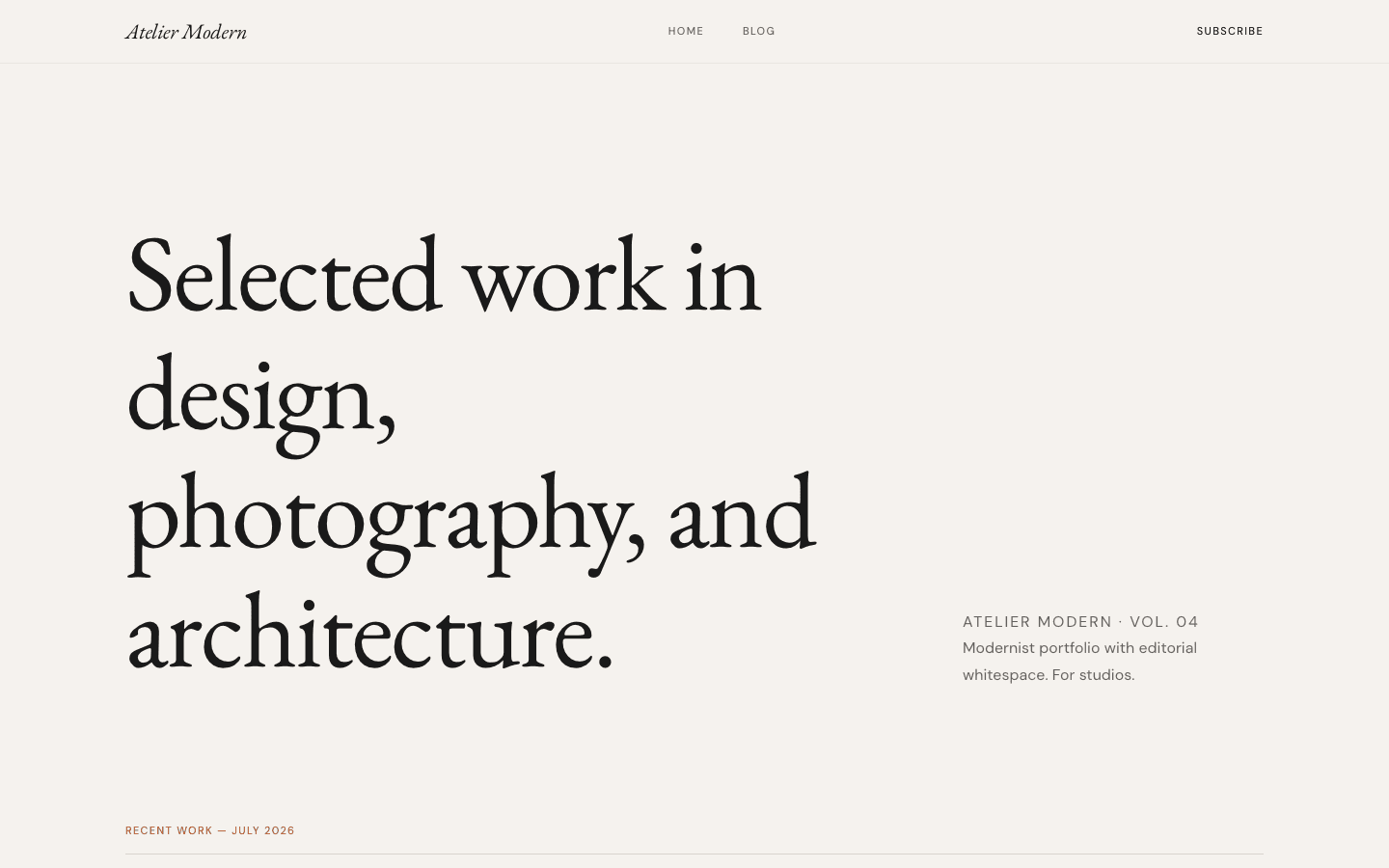
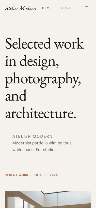
Atelier Modern reads like a studio's printed journal. A translucent bar floats over an ivory ground, the home page opens with a large serif headline and a short caption set off to one side, and below it seven recent posts sit in an uneven three-column bento: one tall feature, two picture cards and a text-only list.
Who it's for
It is meant for practices that publish a few considered pieces rather than a daily feed: design studios, architects, interior designers, illustrators and photographers who write about projects and process. Because the shop and product pages use the same ivory, serif-italic language, a studio selling prints, objects or digital goods can keep one look across journal and store. Pick something else if you need a dark site, a home page that lists dozens of posts, or a hero line you write yourself; the headline is fixed by the theme.
What makes it different
An uneven bento instead of a feed
Under a dated "Recent Work" label, the grid splits into columns weighted five, three and four. Your newest post stands tall on the left with its image, italic excerpt, byline and reading time; the next two get 3:2 pictures in the middle; four more run as a text list.
Type that carries the page
Headings are set in EB Garamond, which is bundled with the theme, and small labels in a plain sans-serif in tracked capitals. The hero headline grows to as much as 112px, the brand mark is italic, and categories sit above titles in a rust tone darkened for legible contrast.
A quiet article page
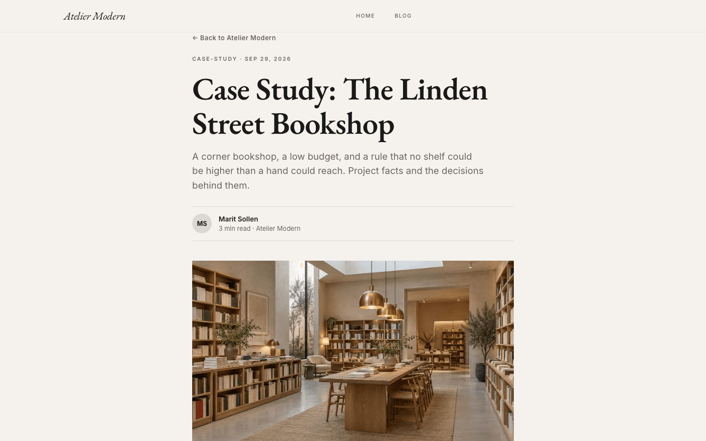
Posts sit in a 720px column with a back link, a category-and-date line, a serif headline, the excerpt as a standfirst, an initials avatar with author and reading time, then a wide cover. Tags become rounded pills that open the filtered blog listing.
A sign-up that stays in its place
When a newsletter or membership path is active and the subscribe widget is on, the header shows a small Subscribe link and each post ends with an outlined box holding an email field. The footer itself stays minimal: name, description, legal links and social icons.
A collection page with hairline rules
The shop has an italic serif title, a square-cornered search box and category tabs underlined in rust when active. Products show at 4:5 in a bordered frame that turns rust on hover and can fade to a second image; simple products get a rust Add to Cart.
Dropdowns and a side drawer
Nested menu items open as square-cornered ivory dropdowns on wide screens. Below 1024px a drawer up to 340px wide opens from the reading end of the line, so it mirrors correctly in Arabic, and lists links in large italic serif with account, cart and Subscribe rows.
Page by page
- Home
- Large serif headline with a side caption, then a seven-post bento of feature, picture cards and a text list.
- Blog
- Category pills, a three-column card grid and page numbers with a Next link.
- Post
- Narrow column, initials byline, 16:9 cover, tag pills, an email box when sign-up is on, and comments.
- Page
- Eyebrow, serif title and standfirst above page-builder content in a 720px column.
- Shop
- Bordered 4:5 product frames, search and rust-underlined category tabs.
- Product
- Large image with a thumbnail strip, italic title, feature list and an FAQ accordion.
Customizing it
With apply-to-theme switched on, the brand settings in Global Design reach Atelier Modern's background, body text, muted text, border colour and the rust accent, plus both the heading and body fonts. The translucent header tints itself from whatever background you choose. Two supporting shades, the slightly darker card surface and the faint divider line, keep their ivory defaults, and corner radius is not exposed, so square and rounded edges stay as drawn.
Honest limits
- It is a light theme only. The stylesheet defines no dark palette and does not respond to a visitor's system colour-scheme preference.
- The large home headline is a fixed line from the theme's translations, not a site setting. Only the caption beside it uses your site description, and without one a sample caption is shown.
- The home page shows at most seven posts. The "Recent Work" label and the "By" before author names on home cards are written in English and do not change with the site language.
- Inner pages shift register: the blog index uses a bold sans-serif title and rounded cards, which is less strict than the square, serif home page.
- The blog listing has category pills and pagination but no search field.
Specifications
- Category
- Portfolio
- Price
- Included
- Plan availability
- Included in every VeloCMS plan
- Commerce-ready
- Yes
- Motion
- No
Frequently asked questions
Can I write my own headline on the home page?
Not from settings. The big line is part of the theme's text. What you control is the caption next to it, which takes your site description, and the brand label above that caption, which is your site name.
Is there a dark mode?
No. Atelier Modern is ivory by design and has no dark variant. You can move the background and text colours in Global Design, but there is no automatic switch for visitors who prefer dark screens.
What happens when a post has no image?
The layout keeps its shape. The home picture cards fall back to gradients built from the theme's colours, and the article cover to a soft beige gradient, so the bento does not collapse while you are still adding pictures.
Can I sell work through it?
Yes. The shop and product pages are designed for this theme, with search, category tabs, gallery thumbnails and an FAQ accordion. Add to Cart appears only once a payment method is enabled, and products with variants send buyers to their detail page.