Chambers
A letterhead-style site for practices that would rather sound measured than loud.
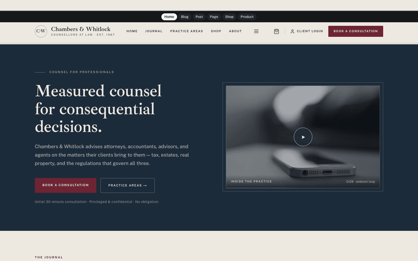
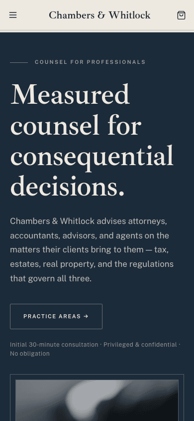
Chambers dresses a professional practice like its stationery. A navy hero band holds your headline and a framed grayscale photograph, your categories become a numbered grid of practice areas, and every page closes on a centred letterhead with a monogram seal. Headings are set in Ibarra Real Nova, an engraved eighteenth-century serif, over Public Sans for body text, on a bone ground with burgundy for anything clickable.
Who it's for
It was drawn for firms that sell judgement: solicitors and attorneys, accountants, financial advisors, and consultants who publish commentary for clients and peers. The out-of-the-box wording speaks like a law office, with phrases such as Book a consultation and Engage counsel, so a tax practice or an advisory firm will feel at home, and much of that wording can be rewritten. A playful brand, a portfolio built on colour photography, or a site that needs a dark palette will be poorly served, because the theme mutes every image to grey and stays light.
What makes it different
A poster hero with restrained movement
The home page opens on a navy band: eyebrow, headline, intro and buttons on one side, a double-framed photograph on the other. On load the copy and the frame slide up 12 pixels without fading, and the photo zooms slowly to 107 percent over eight seconds, then back, on a loop. A reduced-motion system setting switches all of it off.
Practice areas built from your categories
Below the latest three entries, your first six categories fill a three-column grid of cells numbered I to VI in italic Roman numerals, each linking to that category's listing. A site with no categories yet shows one honest General practice cell pointing to the blog rather than six invented legal specialties.
Letterhead chrome
A round seal is made from the initials of the first two words of your site name, and a thin double rule runs under the sticky header and over the footer. The centred footer repeats the seal and name, then your menu, social links and up to six categories. Topbar, founding line, address and disclaimer stay hidden until written.
A consultation button and a letter by post
When a newsletter or membership is set up and the subscribe widget setting is on, a burgundy Book a consultation button appears in the header and hero, a navy band follows the practice grid, and each article ends with a navy box holding an email field. The buttons open your subscribe page; the box signs readers up directly.
A journal that reads like a bulletin
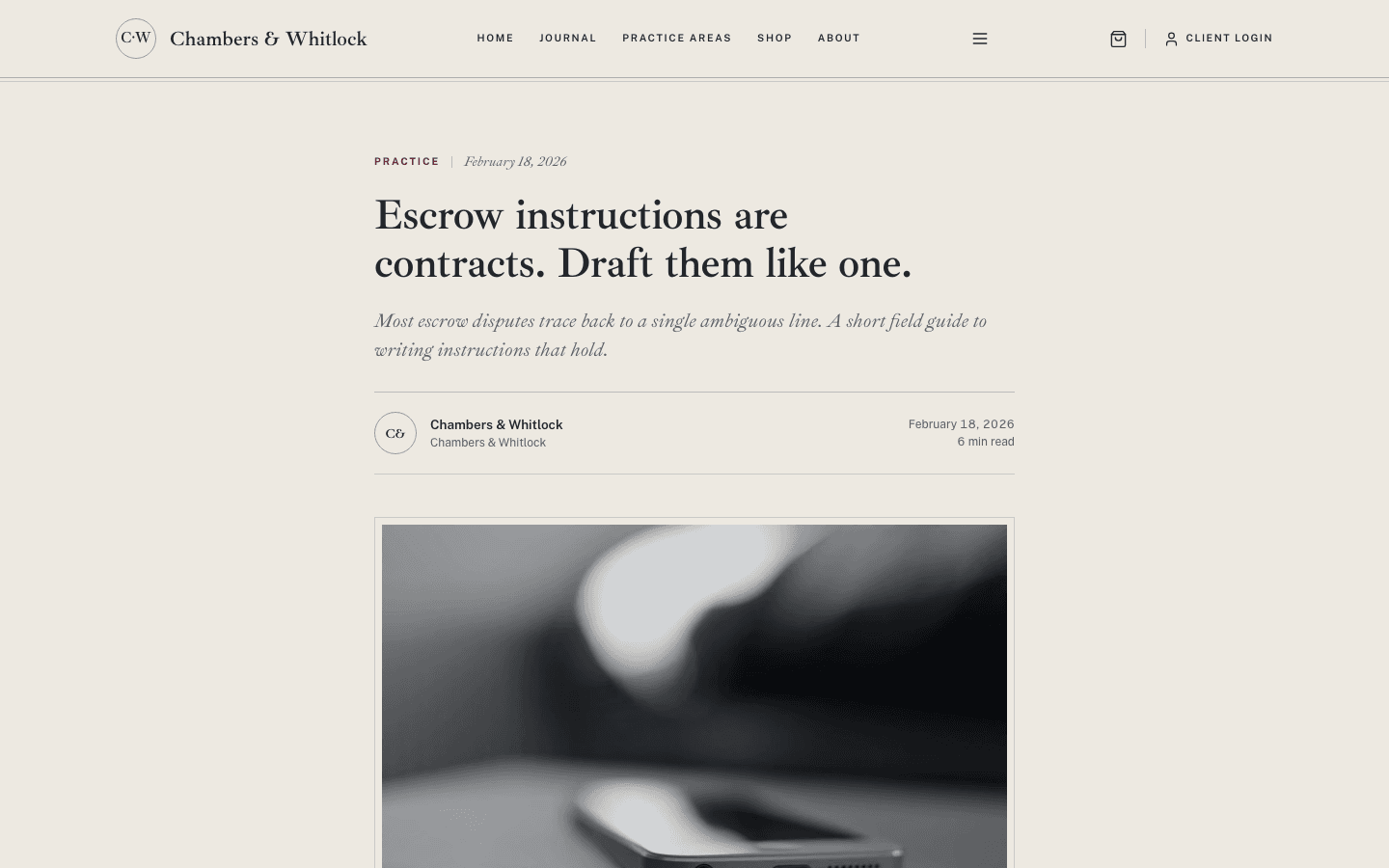
The blog index gives entries numbered labels, framed grayscale thumbnails, up to eight category pills and page-number links. Articles carry an italic standfirst, a byline with the author's initials in a ring, a cover plate, a 65-character prose column with burgundy-ruled quotations, plugin slots around the body and a comments section.
A stationer's desk for documents you sell
The shop lists products in three columns of framed grayscale images with a burgundy kicker, a serif title and a tabular price, plus a wishlist toggle and an add-to-cart button for products without variants. A second image crossfades in on hover. Product pages add a breadcrumb, up to three gallery thumbnails and the buy buttons.
Page by page
- Home
- Navy hero with a framed photo or optional muted video, three latest entries, a numbered practice grid and a consultation band.
- Blog
- Journal masthead, up to eight category pills, a three-column grid of numbered entries and pagination.
- Post
- Italic standfirst, initials byline, grayscale cover, 65-character prose, comments and a navy newsletter box.
- Page
- An eyebrow, serif title and italic description above a narrow prose column, inside the letterhead chrome.
- Shop
- Masthead, category pills and three columns of framed product cards with wishlist and add-to-cart.
- Product
- Breadcrumb, gallery with thumbnails, serif price, add-to-cart and a buy-now button when Stripe is connected.
Customizing it
Turn on Apply my brand to the whole site theme in Global Design and Chambers swaps its palette for yours: the background replaces bone, your text colour replaces charcoal, primary takes over the burgundy buttons and links, and accent recolours the navy hero, active pills and newsletter box. Muted text and the heading and body fonts follow too. Hairlines, the raised practice band, hover shades and corners stay as designed. Wording lives in the Theme Copy panel under General settings.
Honest limits
- It is light only. The stylesheet has no dark variant and does not respond to the visitor's system colour setting.
- Photographs are always shown in grayscale: the hero, card thumbnails, post covers, images inside articles and product photos. There is no switch to keep colour.
- The Book a consultation button is not a booking system. It links to your subscribe page, and it shows only when a newsletter or membership is set up and the subscribe widget is on.
- Several labels keep their law-office wording because Theme Copy does not cover them, including Engage counsel on each practice cell, Client login and the blog heading Insights & commentary. Your Theme Copy text for the consultation button shows on the home page; blog, article and other pages keep the default. The default hero headline also shows until you add a site description.
- The animations stop only when the visitor's system asks for reduced motion; Chambers gets no on-page motion toggle. Tags on an article are plain labels rather than links, and the shop has no search box.
Specifications
- Category
- Animation
- Price
- Included
- Plan availability
- Included in every VeloCMS plan
- Commerce-ready
- Yes
- Motion
- Yes
Good fit for
Frequently asked questions
Is Chambers only for law firms?
No, though its default copy was written for one. The Theme Copy panel in General settings lets you replace nineteen pieces of wording, such as the hero eyebrow, the consultation button, the practice headline and the footer disclaimer, in English and Arabic. A field left empty keeps the original text.
Does the theme animate?
Lightly. The hero text and photo frame rise a few pixels once on load, the hero photo zooms slowly back and forth, and links and cards change colour on hover. Nothing fades in, so content is visible on the first frame, and a reduced-motion system setting turns all of it off.
Can I put a video in the hero?
Yes. Paste an https link into the Scroll journey field of Hero media in General settings and Chambers plays it muted, looped and in grayscale over the poster, adding a play seal and a loop caption. Without a video, the poster is your hero image, then your latest post's image, then a navy-to-charcoal gradient.
Can I sell templates or guides?
Yes. The shop and product pages are part of the theme, with category pills, wishlist toggles, add-to-cart, a hover image on listing cards and a buy-now button when Stripe is connected. Checkout buttons only appear once a payment method is configured.
Will my dropdown menus work?
Yes. When a menu item has children, the desktop header opens them in a square-cornered panel, and the mobile drawer, a bone panel that opens from the side, lists them already expanded and indented under their parent.