Pacific Modern
One italic sentence, four stories in a zig-zag, and a filterable shop on warm sand.
Pacific Modern lets a single sentence open the site. Your site description becomes a large centred italic line in Cormorant Garamond, with no photograph beside it, and under it your four newest posts take turns with the image on the left and then on the right. Slate text sits on a warm sand ground, with an ocean blue for pills and buttons and a soft moss as the second hue.
Who it's for
Built for writers who lean on place and pace: travel and lifestyle bloggers, essayists with a regional beat, photographers who caption their pictures, and small makers who want to sell a handful of prints or guides beside the journal. The front page is deliberately short, so it rewards posts that each carry a good cover and a clear excerpt. If you publish many pieces a day, want a photographic banner at the top, or need a dark palette, another theme will fit better, because Pacific Modern keeps its hero to type and stays light.
What makes it different
Words before pictures on the home page
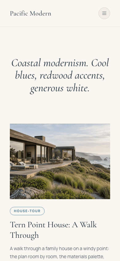
The home hero is one centred heading that takes your site description and sets it in italic Cormorant Garamond at up to 64 pixels. A hero image setting is accepted but not drawn, so the opening screen is type on sand. Without a description, a sample line about the long coast stands in.
Four rows that swap sides
Each of your four newest posts gets a row: a 4:3 cover on one side, then its first tag as an outlined pill, the title, the excerpt and a small capitals line with date and reading time. The cover changes sides every row and the pill alternates ocean and moss. Under 760 pixels the rows stack, image first.
A drawer and dropdowns in the same coastal voice
Sub-items drop down in square-cornered panels of pale sand. Below 1024 pixels a round button brings in a drawer, 300 pixels wide at most, from the reading end: large italic serif links, nested items already open with an indent, a row for the account, plus a cart row and an ocean Subscribe pill when those apply.
Sign-up that waits to be switched on
With a newsletter or membership in place and Show subscribe widget on blog switched on, the header, footer and drawer gain a Subscribe link, and just above the comments every article ends in an outlined Keep reading box with an email field. Sending that form takes the reader to your subscribe page rather than signing them up on the spot.
A shop with real filters
The storefront opens on a centred italic title and a search box, then category links that take an ocean underline when selected, low and high price boxes, and a box to tick for in-stock items. Each card carries a 4:3 image, which may fade to another photo when hovered, then a capitalised category, an italic title and the price.
Product pages in one calm column
A product sits in a column about 820 pixels wide: a back link to the shop, an italic title, a 16:9 image with a strip of thumbnails when there are more photos, and an italic price beside the buy buttons. A description, a list ticked in moss and a question accordion follow when filled in.
Page by page
- Home
- A centred italic headline drawn from your site description, then your four newest posts in alternating image and text rows.
- Blog
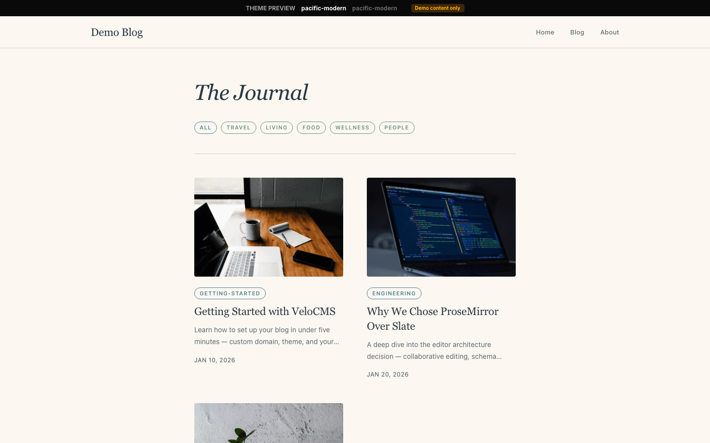
- Your site name under an All Posts eyebrow, then pill filters by category, cards in rows of three, and page numbers ending in a Next link.
- Post
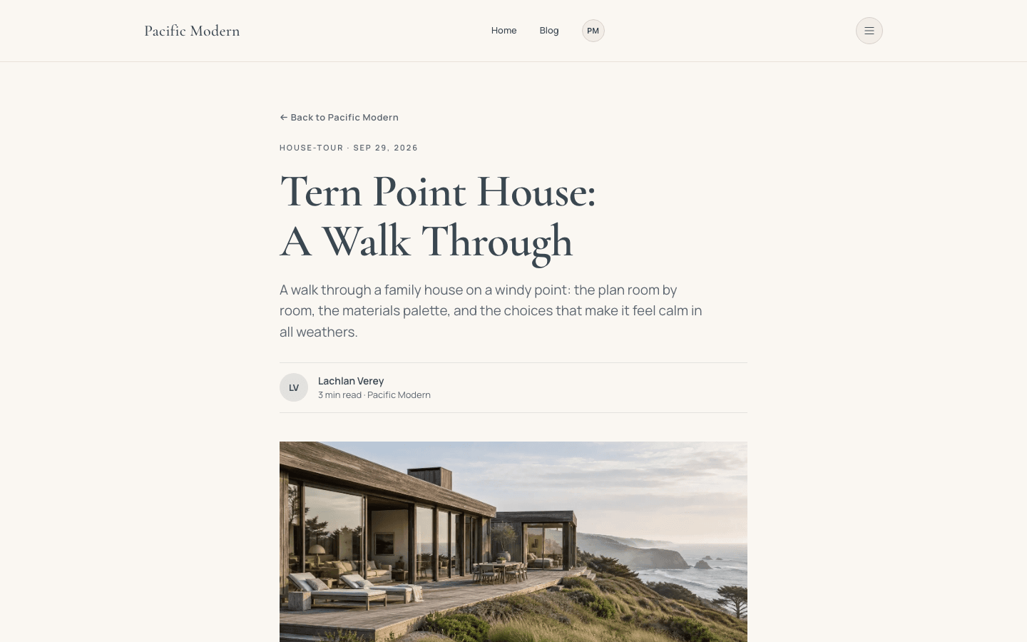
- Back link, tag and date, serif title, excerpt, byline with initials, then the 16:9 cover, tag pills, a sign-up box when enabled, and comments.
- Page
- Page-builder content in a 720-pixel column, introduced by an eyebrow, a serif title and a short standfirst.
- Shop
- Search, category links, filters for a price range and stock, a result count once a filter is on, and a grid of 4:3 product cards.
- Product
- Back link, italic title, thumbnail gallery, price, an add-to-cart button that needs a connected payment method, an included list and collapsible questions.
Customizing it
With Apply my brand to the whole site theme enabled under Global Design, the sand becomes your background and the slate your text colour; primary takes over the ocean blue on pills, buttons and shop accents, and accent replaces the moss. Secondary drives muted text, neutral drives borders, and the theme's fonts give way to yours for headings and body. The hairline rules, the grey used for dates, the darker moss text and the label typeface stay as designed; changing the background shifts the pale surface behind inputs and dropdowns. There is no Theme Copy panel for rewriting fixed wording.
Honest limits
- There is a single sand palette and no dark variant; a visitor's dark-mode preference changes nothing.
- The home hero never shows a picture, even when a hero image is set or the newest post has a cover. It is text only by design.
- The home page lists only your four newest posts and offers no link in its body to anything older. Readers find the archive through the menu or the footer.
- The blog index has category pills and pagination but no search box. Tags on posts and on home rows are plain text, not links to a filtered list.
- A few strings ignore the site language and stay English: the Menu label in the mobile drawer, the Cart counter in the desktop header, the Story label on blog cards without a tag, the empty-blog message and the sample hero line.
- Inner pages change voice a little: the blog title, card headings and article subheadings use the bold body face instead of the italic serif seen on the home page and in the shop.
Specifications
- Category
- Lifestyle
- Price
- Included
- Plan availability
- Included in every VeloCMS plan
- Commerce-ready
- Yes
- Motion
- No
Good fit for
Frequently asked questions
Can I put a photo at the top of the home page?
Not in this theme. The hero shows your site description as a large italic line and pays no attention to the hero image setting. Pictures appear further down as the covers of your four newest posts, and as a wide 16:9 cover near the top of every article.
Where do the coloured pills on the home page come from?
From each post's first tag. The pill sits above the title and switches between an ocean and a moss outline from one row to the next. A post with no tags shows no pill, and the pill itself is not clickable.
Can shoppers narrow products by price?
Yes. Below the search box and category links, the shop has fields for a lowest and highest price plus an in-stock tick box, all working together, with a link to clear them once any filter is active. Shoppers see add-to-cart only after you connect a payment method, and buy-now only with Stripe.
Is there much motion?
Hardly any. Links shift colour on hover, blog cards nudge up two pixels, and shop cards with a second photo fade to it. Nothing animates on load or loops. If the visitor's operating system requests reduced motion, these hover changes happen instantly instead of easing in.