Tropicalia
Terracotta and teal on cream paper, with a cover story and palm-leaf dividers.
Tropicalia dresses a hospitality or travel blog like a boutique hotel brochure. A full-width cover photograph carries a cream card holding the newest story's tag, title and excerpt, a single-stroke palm leaf divides the page, and three more stories follow in a staggered grid. Terracotta, deep teal and sand paper do the rest, with Cormorant Garamond italics for display type.
Who it's for
Tropicalia is for people who sell or describe a place: boutique hotel and villa hosts, scuba schools, surf camps, eco-lodges, island wedding venues and travel or food writers who lead with photography. The cover story needs a strong landscape image to earn its place, so it suits sites that have one for nearly every post. It is a weaker choice for text-only essays, for a dark or austere look, or for a home page that must list more than four recent stories at once.
What makes it different
A cover story with a cream overlay card
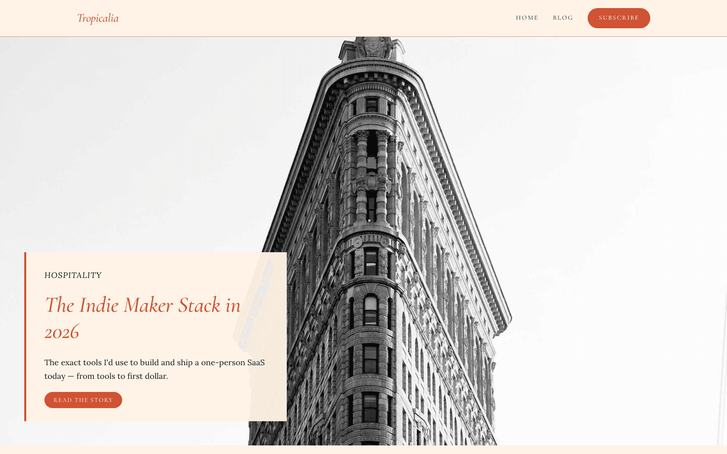
The home page opens on one full-width 16:9 image, taken from your hero image setting or else your newest post. Over its lower-left corner sits a cream card with a terracotta edge: the story's first tag, its title, the excerpt and a Read the story pill. Without any image, a terracotta-to-teal gradient fills the frame.
A palm leaf as the section mark
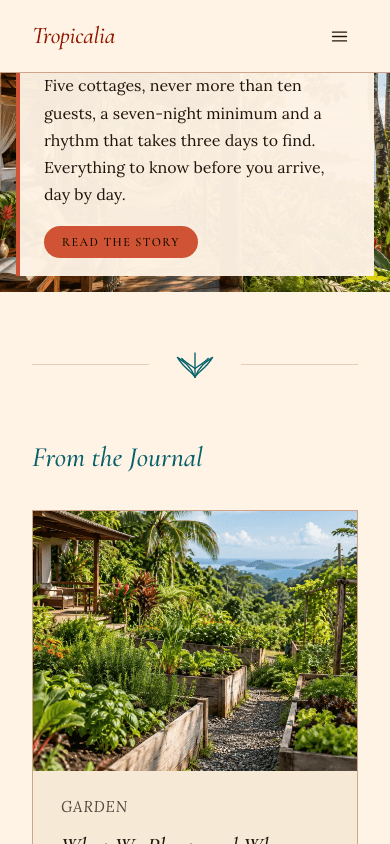
A hand-drawn, single-stroke palm leaf sits between two hairlines to separate the cover from the From the Journal heading. The same leaf is repeated in the centre of the teal footer and, faded, on the not-found page. It is fixed artwork, so every Tropicalia site shares it.
A staggered story grid
Below the leaf, two cards split the row five parts to four, and a wide horizontal card follows, each with caption, italic title, excerpt and date. Hovering outlines a card in hibiscus coral with a soft glow. A View all stories pill closes the section and leads to the full blog index.
A footer in teal, in three parts
The footer is a solid teal band. The left column holds your site name, tagline and any social links you configured; the centre repeats the palm leaf; the right column lists your menu, a Subscribe link when signup works, privacy and terms when those pages exist, and an RSS link. A thin bar underneath carries the copyright.
Photo cards in the shop
Products sit in a grid that fits as many 300-pixel columns as the screen allows. Each card shows a 4:3 photograph, which crossfades to a second gallery image on devices with a mouse, a teal category label, an italic title, 90 characters of description and a price. Search, category pills and price and stock filters sit above the grid.
Product pages built around a gallery
A product opens with a terracotta-edged title, then a 16:9 gallery with clickable 72-pixel thumbnails, a description on a sand panel and a feature list. A centred buy panel repeats the product name and tagline beside add-to-cart, and a second button goes straight to checkout when Stripe is connected.
Page by page
- Home
- Cover photograph with an overlay card, a palm-leaf divider, a staggered three-story grid, a View all stories pill and the teal footer.
- Blog
- Eyebrow, site name, description, rounded filter chips and a three-column grid of picture cards, then numbered pages and the teal footer.
- Post
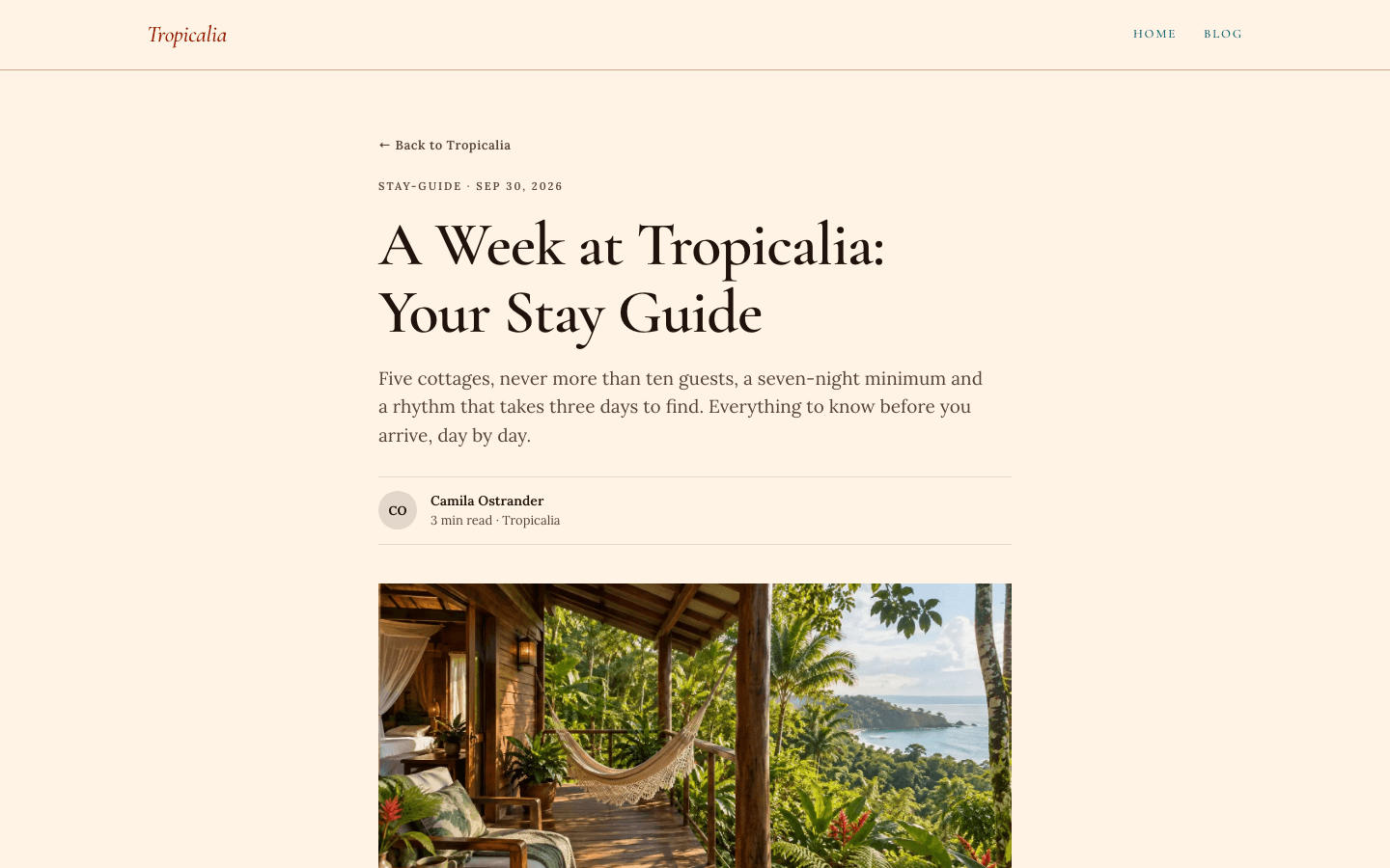
- Back link, tag and date, serif title, excerpt as standfirst, initials byline, 16:9 cover, 18px prose, tag pills, comments and the palm-leaf footer.
- Page
- An eyebrow, serif title and standfirst above your page content in a 720-pixel column, closed by the teal footer.
- Shop
- Terracotta-ruled italic title, search, category pills, price and stock facets and a grid of photo cards.
- Product
- Back link, italic title, gallery with thumbnails, description, features, a buy panel and an expandable question list.
Customizing it
Apply your Global Design to the theme and Tropicalia swaps in your background and text colours. Your primary colour replaces terracotta on the brand name, pills and prices, your accent colour replaces teal on menu links, the palm leaf and the footer, and your secondary and neutral colours take over muted text and borders. Chosen heading and body fonts replace the defaults. The sand surface, coral hover glow, banana highlight, gradients and 4-pixel corners stay fixed.
Honest limits
- There is no dark variant: one cream palette is all the stylesheet defines, and nothing in it responds to a visitor's dark-mode or reduced-motion setting, so hover glows and colour transitions always play.
- The home page shows four stories: the cover plus three cards. Older posts are reached through View all stories. With fewer posts, the grid simply shortens, and with none it shows three gradient placeholder cards.
- A handful of strings are hard-coded in English: the Destinations, Journal and Notebook captions that stand in for a missing tag, the Next link under the blog index, the Welcome to headline and Read the journal button of an empty site, and the comment count. Arabic visitors read these unchanged.
- Phone navigation is flat: the drawer prints children right after their parent as equal links, with no indent and no fold-away control. Only the desktop dropdown conveys the hierarchy.
- The palm-leaf drawing cannot be replaced or removed from the divider and footer, and the cream overlay card always sits at the lower left of the cover (full width on phones).
- Paragraph text asks for its serif by family name instead of by the platform's bundled files, so unless you pick fonts in Global Design, a device lacking that face falls back to Georgia.
Specifications
- Category
- Hospitality
- Price
- Included
- Plan availability
- Included in every VeloCMS plan
- Commerce-ready
- Yes
- Motion
- No
Good fit for
Frequently asked questions
Which image does the cover use?
Your hero image setting wins; if it is empty, the newest post's image is used, and if that is missing too, a terracotta-to-teal gradient appears. The overlay card always describes the newest post, whichever image sits behind it.
Can I show more than four stories on the home page?
Not in this layout. The home page is fixed at the cover and three cards. The blog index, reached through View all stories or your menu, lists every post in a three-column grid with filter chips by category.
Can I sell rooms, tours or products?
Products, yes. Tropicalia ships its own shop and product pages, with add-to-cart buttons once a payment method is connected and a cart link in the header. Room or tour booking is not part of the theme, so use product pages or a booking link in your menu.
Does the subscribe button always show?
No. The terracotta Subscribe pill in the header, the footer link and the inline form at the end of articles appear only when a newsletter or membership is configured and the subscribe widget setting is on.
How do sub-menus work?
On desktop, a menu item with children opens a small dropdown beneath its teal uppercase link. In the phone drawer, the children are listed as ordinary links after their parent.