Studio Newsroom
Salmon paper, navy ink and teal rules, set out as a three-column front page.
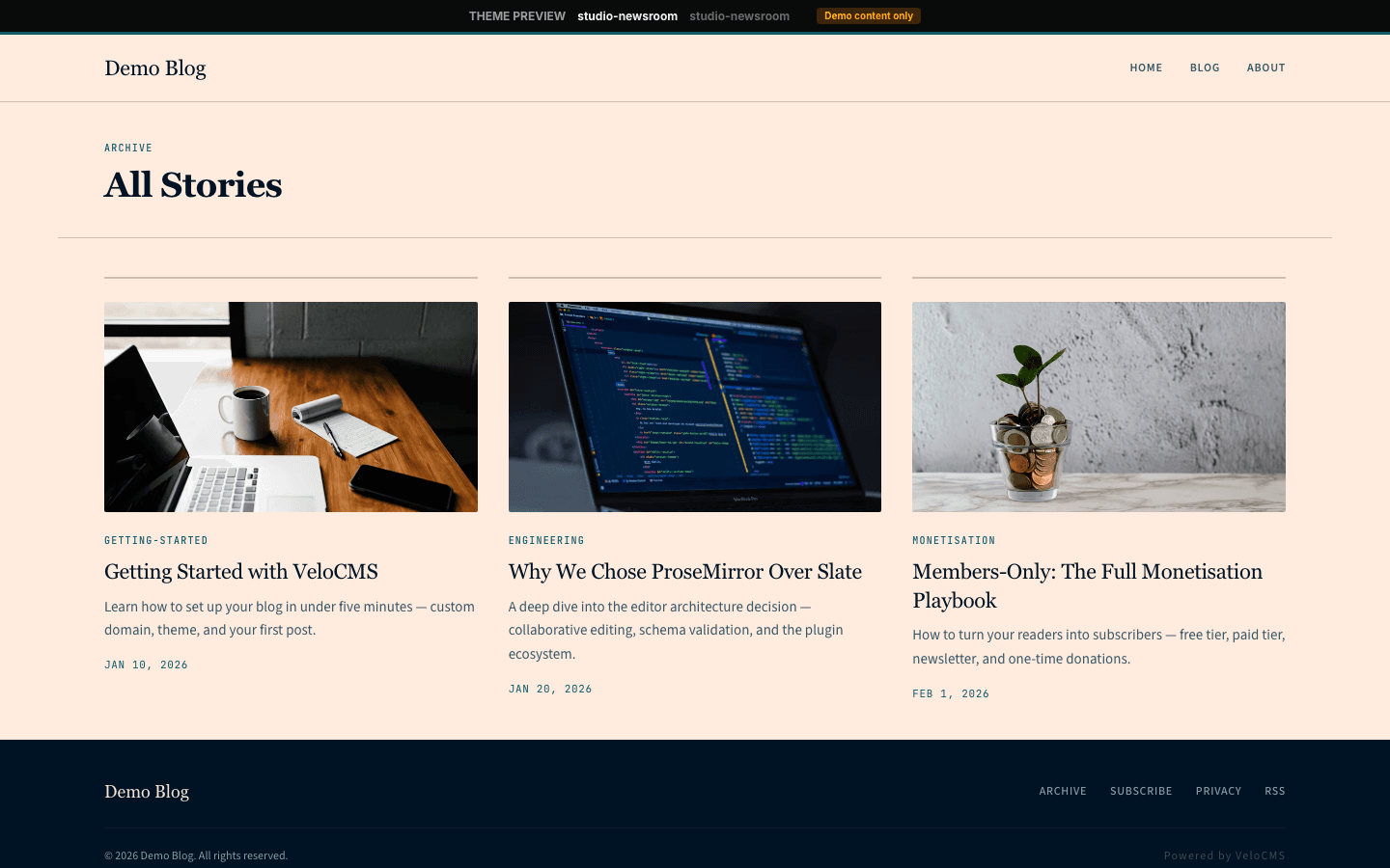
Studio Newsroom borrows the look of a financial daily. The page is salmon paper with navy text, a thin teal rule runs across the top, and the home page is a newsroom grid: one lead story with a large headline, a column of the latest stories beside it, and a narrow briefing rail. Headlines are set in Lora, with small monospaced labels for sections and dates.
Who it's for
It is built for publishers who run a newsroom rather than a diary: independent news sites, B2B trade titles, policy analysts, market commentators and newsletter teams who publish several pieces a week and want readers to scan before they read. The home page shows up to eleven stories at once, so it rewards a steady rhythm of posts. A monthly blog will find the grid thin; a dark or portfolio look belongs elsewhere.
What makes it different
A front page with a lead, a column and a rail
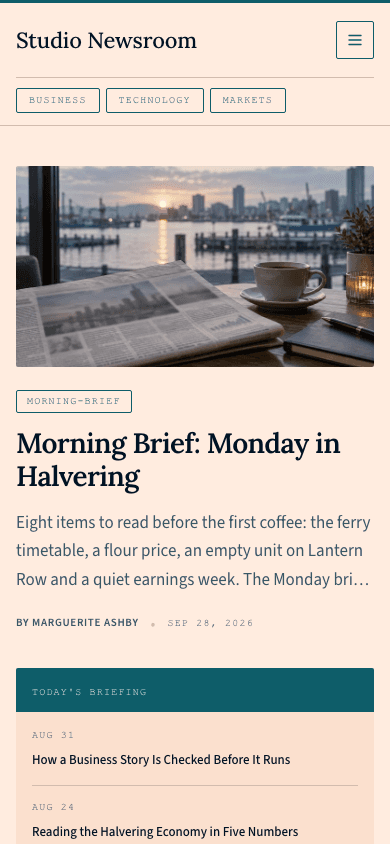
The home grid splits into three columns in the ratio six, three and two. Your newest post leads with its own 16:9 image, a tag chip, a headline up to 44 pixels, a three-line deck and a By line with the date. Beside it, the next three stories appear as tag, title and date under a Latest stories heading.
A briefing rail with a morning card
The narrow right column carries Today's Briefing, a teal-headed box listing the next three posts as a date and a headline. Below it, a Morning Briefing card with a teal Subscribe Free button appears only when a newsletter or membership is configured and the subscribe widget setting is on.
Section chips and dropdown menus
Under the masthead, up to six of your categories become small teal-outlined chips in monospaced capitals that fill with teal on hover and scroll sideways if they overflow. Nav links are small uppercase text, and an item with children opens a compact dropdown with a 2-pixel corner on wide screens.
A drawer made of section chips
Below 1024 pixels the menu moves into a 320-pixel panel that slides in from the end edge of the line, capped by a 3-pixel teal rule. Links appear as hairline chips that fill teal for the current page, under a monospaced section label, above an account row, a shop cart row and a Subscribe Free button on a navy block.
A shop laid out like a newsroom grid
The shop opens with a teal top rule and a large Lora title, then search, category chips and price and stock filters. Products fill a grid at least 240 pixels per card on a tinted surface with 2-pixel corners, each with a 4:3 photograph that crossfades to a second image on hover, a monospaced category label and a price.
A product page with a sticky buy panel
A product splits into two columns, three parts to two. The left holds a 4:3 gallery with 64-pixel thumbnails, the description, the feature list and the questions. The right keeps a bordered panel pinned while you scroll, with the title, tagline, price, add-to-cart and, when Stripe is connected, a full-width Buy Now button.
Page by page
- Home
- Teal top rule, masthead with section chips, a lead story, Latest stories, the briefing rail, a four-story More grid and a navy footer.
- Blog
- Masthead with chips, an eyebrow, the site name, description, filter pills and a three-column card grid with numbered pages.
- Post
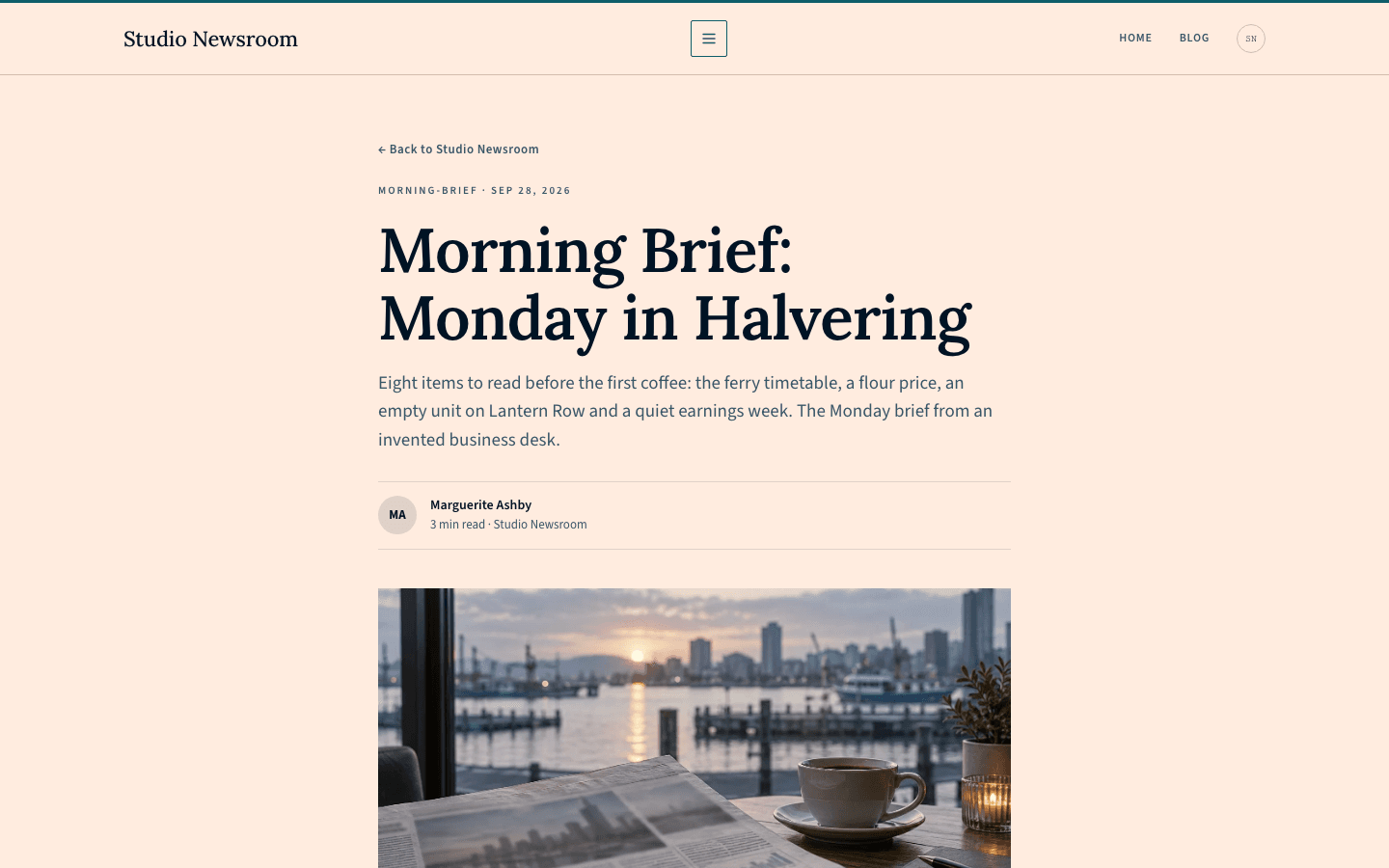
- Back link, tag and date, serif title, the excerpt as a deck, an initials byline, a 16:9 cover, tag pills, an inline subscribe form and comments.
- Page
- An eyebrow, serif title and deck above your content in a 720-pixel prose column, framed by the masthead and navy footer.
- Shop
- Teal rule, large title, search, category chips, price and stock filters and a grid of bordered product cards.
- Product
- A gallery and description column beside a sticky panel with price, add-to-cart and checkout buttons, then features and questions.
Customizing it
Apply your Global Design to the theme and Studio Newsroom swaps in your background and text colours. Your primary colour replaces teal on the top rule, chips, labels, widget headers and buttons, your secondary and neutral colours set muted text and hairlines, and chosen heading and body fonts replace Lora and the sans body. The navy footer is a deliberate inversion that is not bridged, and the tinted surface, monospaced label face and 2-pixel corners stay fixed.
Honest limits
- One light palette only. No rule in the stylesheet reacts to a visitor's dark-mode or reduced-motion preference.
- The home page ignores the hero image: the lead story shows the newest post's own picture, or a teal gradient when it has none. With fewer than eleven posts, the four-story grid at the bottom repeats your first four posts instead of showing older ones.
- Some wording is hard-coded in English and never translated: Today's Briefing, Morning Briefing and its sentence, the By before an author, No stories yet, the Merch eyebrow and fallback category, Buy Now, No stock in this edition and the Next link. Arabic readers see all of it in English.
- Narrow screens shed columns. Under 1100 pixels the briefing rail disappears, and under 760 the Latest stories column goes too, leaving the lead story and the bottom grid.
- In the phone drawer, children become chips of equal rank listed after their parent, with no indent or fold control; only the desktop dropdown shows the hierarchy.
- The body sans is requested by family name rather than through the platform's bundled font files, so unless you choose fonts in Global Design, a device lacking it falls back to a system sans.
Specifications
- Category
- Business
- Price
- Included
- Plan availability
- Included in every VeloCMS plan
- Commerce-ready
- Yes
- Motion
- No
Good fit for
Frequently asked questions
Which post becomes the lead story?
Always your newest post. The next three fill the Latest stories column, and the three after those fill Today's Briefing. Pinning is not part of this layout, so publish in the order you want readers to see.
Do bylines appear?
Yes, when a post has an author name. The lead story prints By followed by the name, a bullet and the date; without an author, only the date shows. Articles show an initials byline with the reading time instead.
Can I run a shop alongside the news?
Yes. Studio Newsroom ships its own shop and product pages, with a cart link in the header once the site sells products. Add-to-cart buttons need a connected payment method, and products with variants open a separate page to choose options.
Can the footer match my brand colours?
Not with Global Design. The navy footer is intentionally left outside the colour bridge so that the inverted look survives a custom palette. Its links, rule and copyright line still follow the menu and legal pages you configure.
How do sub-menus behave?
On a wide screen, an item with children opens a small dropdown under its uppercase link. On a phone, the same children are shown as ordinary chips after their parent instead of nested beneath it.