Stillpoint
A quiet practice website that talks in sessions, not sales.
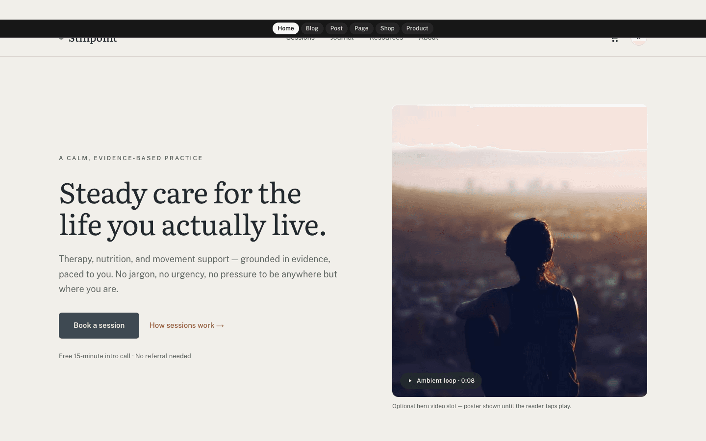
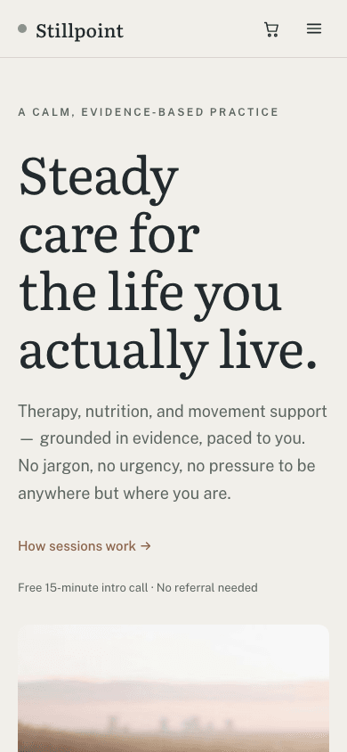
Stillpoint gives a care practice a soft, unhurried front door. The home page pairs a large serif headline with a tall rounded photograph, then three recent journal entries on pale cards. About pages can carry a credentials card beside the text, the shop reads like a shelf of workbooks, and the footer sits on a deep ink band. Headings use Literata and body text uses Public Sans, on a bone ground.
Who it's for
Stillpoint is meant for people whose work is a relationship with clients: therapists and counsellors, dietitians and nutritionists, yoga and movement teachers, coaches, and small clinics that publish practical advice between appointments. The default wording already speaks that language, with Book a session, How sessions work and a note about a free intro call, and most of it can be replaced. A practice that wants a dark look, a busy services grid on the home page, or built-in online scheduling should look elsewhere or add a plugin, because Stillpoint is light only and its session buttons lead to your subscribe page.
What makes it different
Session buttons that only appear when they lead somewhere
A slate Book a session button sits in the header, hero, about-page sidebar and phone menu. The home footer adds a subscribe column, and articles end with a sage box whose email field forwards readers to your subscribe page. None of this appears unless you have a newsletter or membership and Show subscribe widget on blog is switched on.
A credentials card beside your about page
Ordinary pages split into two columns: the text on the left and a 340-pixel sidebar on the right. If you fill the Author Bio field in General settings, it appears there in a pale card headed Credentials, with your line breaks kept, so licences and training can be listed one per line.
A journal paced for slow reading
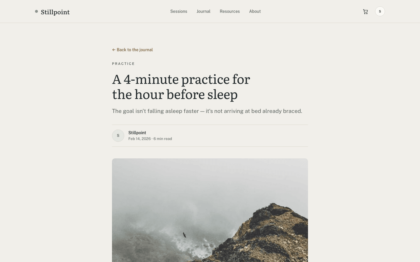
Articles use a 720-pixel measure and 18-pixel body text, with a short standfirst, the author's initials set in a sage circle on the byline, and a rounded cover. Quotations turn into large italic serif lines with a clay rule. Tags become pill links to matching posts, and comments follow the text.
A resources shelf for workbooks and audio
The shop leads with a serif headline and a short paragraph you can rewrite, then category pills and three columns of rounded cards showing category, title, a trimmed description and price. Cards lift on hover, a second photo can fade in, and simple products show add-to-cart as soon as Stripe or PayPal is hooked up.
Product pages with a checklist of what is inside
A product page sets a large 4:3 photo and up to three thumbnails beside the title, price and description. Your feature list becomes a column of sage ticks under About this product. A delivery line reads instant digital delivery or ships to you, depending on whether the product needs shipping.
Page by page
- Home
- Serif headline and rounded poster photo, an optional muted video, then the three latest journal cards.
- Blog
- Journal heading, filter pills (All and up to eight categories), cards in threes, and page numbers.
- Post
- Back link, first tag as eyebrow, initials in the byline, rounded cover, prose capped at 65 characters a line, tag pills, comments and a sage signup box.
- Page
- Eyebrow and serif title over the text, with an optional credentials card and session button in a sidebar.
- Shop
- Shop eyebrow over a serif headline you can rewrite, category pills and rounded product cards, three per row on large screens and two on phones.
- Product
- Gallery with thumbnails, serif title, price, Buy now when Stripe is connected, add-to-cart and a feature checklist.
Customizing it
Once Apply my brand to the whole site theme is enabled (Global Design), bone gives way to your background and ink to your text colour, which also paints the footer band; primary recolours the slate buttons, selected pills and focus outlines, accent recolours the clay cart badge and quotation rule, and secondary takes over the muted text. Headings and body adopt your chosen fonts too. Hairlines, sage eyebrows, the pale card colour and clay text links stay as designed. Eighteen pieces of wording are editable in Theme Copy.
Honest limits
- Only a light palette exists; a visitor whose device prefers dark mode still gets bone and ink.
- The home page is short: a hero and the three newest posts. The credential strip and sessions band named in the catalog description are not rendered, and on the home page categories appear only as footer links.
- Book a session is not a scheduler. It opens your subscribe page. The default hero fine print and the phone-menu footer both say Free 15-minute intro call · No referral needed whether or not you offer one, so rewrite them in Theme Copy if that is untrue.
- Blog pagination shows links to pages one to three and a Next button, with no Previous link, so deep archive pages are reached one step at a time.
- Some labels are fixed English text: View → on shop cards, and Buy now and Payments aren't configured for this store yet on product pages. An Arabic site will show them in English.
- There is no shop search, and listing cards carry no wishlist toggle.
Specifications
- Category
- Animation
- Price
- Included
- Plan availability
- Included in every VeloCMS plan
- Commerce-ready
- Yes
- Motion
- Yes
Good fit for
Frequently asked questions
Can visitors actually book a session through Stillpoint?
Not by itself. Every Book a session button links to your subscribe page, where people join your newsletter or membership. For real appointments, pair the theme with the Calendly or Bookings & Appointments plugin and rename the button in Theme Copy so the promise matches.
Does it work for a coach or a yoga studio rather than a clinic?
Yes. Theme Copy in General settings covers the hero eyebrow, the button, the fine print, the journal headline, the footer tagline, the shop headline and more, in English and Arabic. Empty fields keep the original text. Until you add a site description, the hero shows a default headline about steady care.
Is there any animation?
A little. On load, the hero text, the photo, the home journal cards and the shop heading rise a few pixels into place without fading, and cards lift on hover. It is not listed as a motion theme. Visitors who have reduced motion turned on in their device settings get no rise, instant hover changes instead of eased ones, and no hero video, only the still photo.
Can I put a video in the hero?
Yes. In General settings, put an https link to an MP4 in Hero media, in the field labelled Scroll journey. Stillpoint plays it muted and looping over the poster rather than scrubbing it with scroll, and adds a small Ambient loop label. Without a video, the poster falls back from your hero image to your newest post's picture and finally to a sage-to-slate gradient.
How does the menu behave on a phone?
Below 1024 pixels the links fold into a hamburger. It opens a 320-pixel panel from the reading-start edge, left in English and right in Arabic, without a sliding effect, holding your menu, the session button when enabled, a cart row for shops, an account row and the intro-call line. Submenus appear open from the start, stepped in under their parents.