Studio Calm
One narrow column, a light italic quote and a front page without pictures.
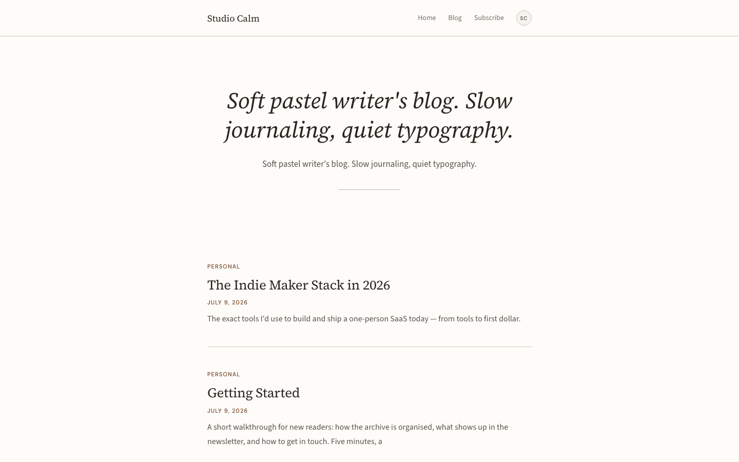
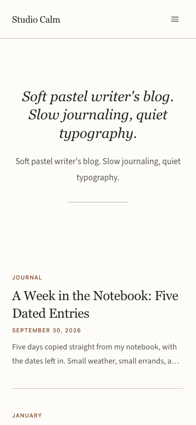
Studio Calm gives a writer's site the stillness of a reading room. Your site description is set large in light italic serif on warm off-white, with a short hairline under it, and the posts that follow are plain entries in a single narrow column: a terracotta label, a title, a date and two lines of excerpt. Not one image appears on the front page.
Who it's for
Studio Calm is for people whose work is sentences: essayists, columnists, independent journalists, reflective bloggers and newsletter writers who publish a few considered pieces rather than a constant stream. The front page gives every post the same weight and spends nothing on thumbnails, so a site with sparse photography never looks unfinished. It is a poor fit for visual portfolios, magazines that lead with a hero photograph, or anyone who wants a dark palette or a busy multi-column home page. A small shop suits it if a quiet text list fits what you sell.
What makes it different
A pull-quote where the hero image would be
The home page opens on your site description in light italic serif, up to 44 pixels tall, repeats it beneath as a calmer paragraph and closes the block with a 120-pixel hairline. Until a description is saved, the quote falls back to the line Slow thoughts for curious minds. The hero image setting is not read.
Entries as text, separated by hairlines
Under the quote sit your six newest posts. Each shows its first tag as a small terracotta label, a 26-pixel serif title, the date in the same label style and an excerpt clipped to two lines. A brand-new site with no posts shows one placeholder entry that points you to the blog.
A subscribe card that appears only when it can work
Once a newsletter or membership is configured and the subscribe widget setting is on, the home page ends on a soft cream card with an italic heading and a terracotta button. The header link, the drawer button and the form closing each article obey the same condition. Without it, none of them is drawn.
Desktop dropdowns in the theme's own colours
On wide screens a menu item with children opens a compact panel below the link, painted from the theme's surface, text and hairline colours with a 6-pixel corner. A flat menu stays a row of plain links and ships no extra script. On phones, children appear as ordinary links inside the drawer list.
A shop that reads like a list
The shop is a centred, image-free list: a caps label, a light italic heading, an underlined search field, category chips and a small form for minimum price, maximum price and in-stock only. Each row gives the category, the title, the first 100 characters of the description and a terracotta price, plus add-to-cart once a payment method is connected.
Product pages that stay in the column
A product keeps to the same 680-pixel width: a back link, a centred italic title, the tagline, a hairline, the price and add-to-cart. A description, a dot-marked included list and expanding questions follow. When Stripe is connected, a second button sends the buyer straight to checkout.
Page by page
- Home
- Italic pull-quote from your site description, a 120-pixel hairline, six text entries and, when subscribing works, a cream subscribe card.
- Blog
- Eyebrow, site name, description, rounded filter chips and a three-column grid of bordered picture cards with numbered pagination.
- Post
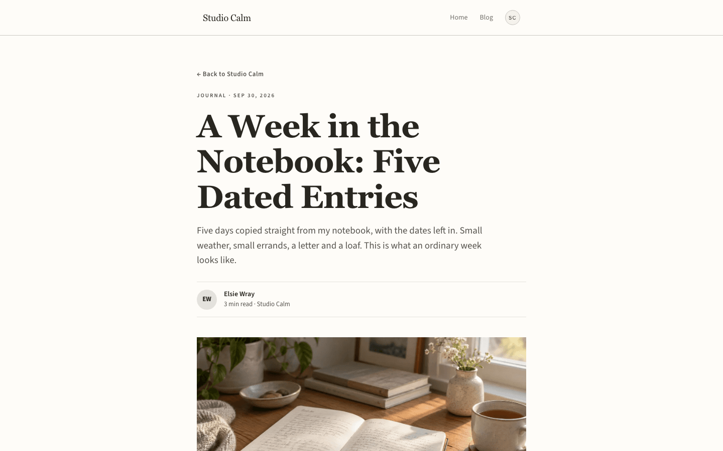
- Back link, tag and date eyebrow, serif title, the excerpt as standfirst, an initials byline, a 16:9 cover, 18px prose, tag pills and comments.
- Page
- A small eyebrow, a serif title and a standfirst above your content, set in a 720-pixel prose column.
- Shop
- Centred italic title, underlined search, category chips, price and stock facets and an image-free product list.
- Product
- Back link, italic title, price, add-to-cart, description, a dot-marked included list and expandable questions, with no photographs.
Customizing it
Apply your Global Design to the theme and Studio Calm adopts your background and text colours, a legible shade of your secondary colour for muted lines and your neutral colour for the short rule under the quote. Your primary colour replaces terracotta on labels, prices, links and buttons, and any heading or body font you pick overrides the serif and sans pair. The cream card surface, lighter hairlines, caps label face, column width and corner radii stay as designed.
Honest limits
- Light only. The stylesheet carries one warm cream palette and has no rule that follows a visitor's dark-mode setting or reduced-motion preference.
- The home page shows six posts at most and ignores the hero image. The blog index does use thumbnails in a three-column card grid, so the image-free look belongs to the front page, the shop and product pages only.
- Your site description is printed twice on the home page, as the pull-quote and again as the paragraph beneath it, so keep it to one sentence.
- Some English is fixed in the theme: Next on the pagination, Back to followed by your site name on article pages, the What's included heading on products, the comment-count wording and the Essay label on an empty home page. Arabic visitors see these in English.
- The mobile drawer lists sub-items as plain links in one run, with no indentation or collapse toggle; only the desktop dropdown shows the hierarchy.
- The stylesheet names its serif, sans and label fonts by family instead of through the platform's bundled font files, so unless you choose fonts in Global Design, a device without them shows a fallback such as Georgia.
Specifications
- Category
- Serif
- Price
- Included
- Plan availability
- Included in every VeloCMS plan
- Commerce-ready
- Yes
- Motion
- No
Good fit for
Frequently asked questions
Does the home page ever show images?
No. The front page is deliberately picture-free and ignores the hero image setting. Pictures still appear on blog index cards and above each article. Without an image, the index card image area stays blank and the article cover shows a cream, lavender and tan gradient.
Where does the large italic quote come from?
It is your site description. Change the description and the quote changes with it, and the same sentence also appears below as the smaller paragraph, so write something that survives being read twice.
Can I sell things with Studio Calm?
Yes. It ships its own shop and product pages in the same quiet style. Add-to-cart buttons appear once a payment method is connected, products with variants open their own page for choosing an option, and a cart link shows in the header when the site sells products.
How wide is the text?
The home page, shop and product content sit in a 680-pixel column. Articles and static pages use a slightly wider 720-pixel prose column, and the blog index opens up to a 1200-pixel grid for its cards.
Can the menu have sub-items?
Yes. On desktop, an item with children opens a small dropdown. In the phone drawer the same children are listed as ordinary links one after another, without nesting.