Cyber Synthwave
Hot pink and cyan neon over a violet-black void, with a grid horizon under the hero.
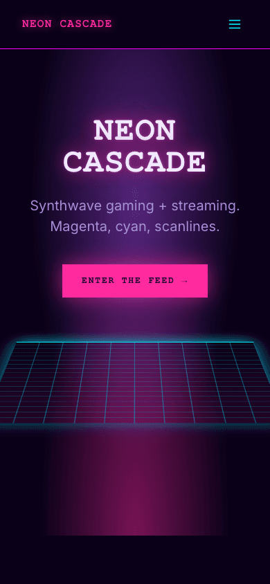
Cyber Synthwave sets your blog name in huge uppercase monospace with a pink glow behind the letters, on a background so dark it is nearly black with a violet cast. Under the title, a cyan grid tips back in perspective like the horizon on an old arcade cabinet. Further down, your six newest posts sit in dark cards that flare pink when a cursor passes over them.
Who it's for
It suits people whose subject already lives on a screen after dark: streamers posting schedules and recaps, indie game developers keeping a devlog, esports analysts, synthwave and electronic musicians, and authors of cyberpunk fiction. Even the default hero line, shown until you write a site description, opens with Gaming. Streaming. Synthwave. If you sell merch or digital downloads, the shop and product pages carry the same glowing pink titles and cyan prices. Choose something quieter if your readers expect a light page or long, sober reading, because this palette never dims.
What makes it different
A neon title over a grid horizon
The home page opens on your blog name in uppercase monospace, scaling up to 144 pixels on wide screens, wrapped in a layered pink glow. Your site description sits beneath it, then a glowing pink Enter The Feed button, and last a cyan grid tilted back in perspective to form a horizon.
Six fresh posts as glowing cards
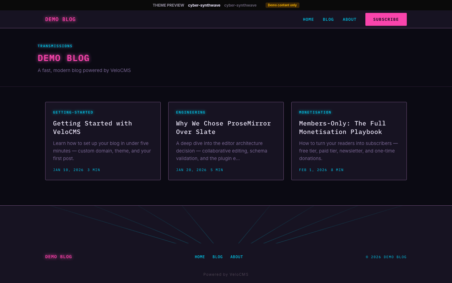
Under a Latest From The Grid heading and a thin cyan rule, the six most recent posts fill three columns, falling to one column on narrow screens. Each card carries the cover image, first tag as a kicker, title, excerpt, date and read time, and picks up a pink border and halo on hover.
Articles set for long reading
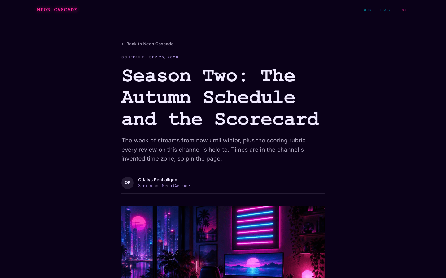
Articles narrow to a 720-pixel column with 18-pixel body text. A byline with initials, a 16:9 cover and tag pills frame the writing, and comments close it. A post with no cover gets a pink-to-cyan gradient instead. When a newsletter or membership is active and the subscribe widget is on, a Keep reading signup box follows the tags.
A storefront with a prompt-style header
The shop opens with a > Store readout above a large glowing title and an item count. Search, category pills and a minimum price, maximum price and in-stock filter sit over a grid of square-cornered cards with cyan prices. Cards swap to a second image on hover when one exists, and an empty shop prints > NO_DROPS_FOUND.
Product pages with neon calls to action
A product page pairs its image with a glowing pink title and a cyan price, then add-to-cart and, when Stripe is connected, a direct buy button. A thumbnail strip, a What's included checklist, a repeated call to action and a plus-and-minus FAQ accordion follow. A sold-out item shows an out-of-stock marker instead.
Dropdowns and a side drawer
Menu items with children become dropdowns on desktop, skinned with a pink border, cyan links and square corners. Below 1024 pixels they move into a 320-pixel drawer docked to the side, which shows the same tree and ends with an account row, a cart row on stores, a Subscribe button when signup is on and a footnote.
Page by page
- Home
- Glowing typographic hero with a grid horizon, the six newest posts in neon cards, and a three-column footer.
- Blog
- All Posts eyebrow, category pills, three-column image cards and numbered pagination.
- Post
- Narrow column, initials byline, cover or gradient, tag pills, optional signup box and comments.
- Page
- Page-builder content in a narrow column under the shared neon header and footer.
- Shop
- Store readout, search, category pills, price and stock filters, and a grid of sharp cards.
- Product
- Image gallery, glowing title, cyan price, feature checklist, repeat CTA and FAQ accordion.
Customizing it
Switch on apply-to-theme in Global Design and the theme picks up your background, text and secondary text colours, a primary colour that stands in for the hot pink, an accent that stands in for the cyan, an accent text shade for nav links and kickers, and a neutral used for borders. Your heading font replaces the monospaced face that drives the nav, titles, labels and prices, and your body font replaces Inter. Card surfaces, the footer band and the magenta lines under the nav and above the footer stay fixed.
Honest limits
- Dark only. The stylesheet has no light palette and ignores a visitor's light or dark system preference.
- The glows are written as fixed pink and cyan shadows. Choosing a new primary or accent colour recolours text, fills and borders, but the haloes around titles, cards and buttons stay pink and cyan.
- The home hero is typographic only: a hero image set for the site is not shown. The home page lists just the six newest posts with no pagination; the full archive lives on the blog page.
- The blog archive and article pages use rounded cards, pill-shaped tags and neutral tints, so they read calmer than the hard-edged home page and shop.
- The blog listing has no search box. Search is offered only in the shop.
Specifications
- Category
- Gaming
- Price
- Included
- Plan availability
- Included in every VeloCMS plan
- Commerce-ready
- Yes
- Motion
- No
Frequently asked questions
Is there a light version of Cyber Synthwave?
No. It ships a single dark palette and does not follow the visitor's system setting. You can change its colours through Global Design, but the design assumes neon on near-black.
Does anything animate?
Nothing moves on its own. The horizon grid is a static perspective drawing. Motion only answers the visitor: on hover, colours, borders and glows fade in over a fraction of a second, blog cards lift by two pixels and shop cards cross-fade to a second image, and desktop dropdowns fade open.
Can I sell merch or downloads with it?
Yes. The theme has its own shop and product layouts with search, price and stock filters, hover images, a feature checklist and an FAQ accordion. Cart buttons appear once a payment method is connected; until then a product page says it is not yet available.
Will the arcade look survive a font change?
The monospace character comes from the heading font slot, which also styles the nav, labels and prices. Pick another monospace face there to keep the effect; a serif or sans heading font changes the mood across the whole site.
Does it only work for gaming blogs?
No, but the defaults lean that way: the hero button reads Enter The Feed, the drawer footnote says The grid never sleeps, and the palette is pure neon. Music, streaming and science-fiction sites fit just as well.