Hackerstack
Deep navy, neon green and monospaced type for engineers who write and ship.
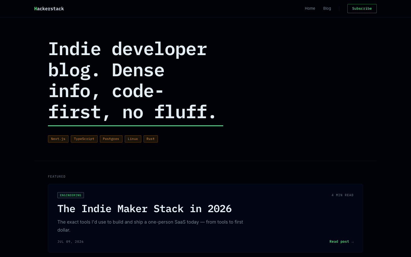
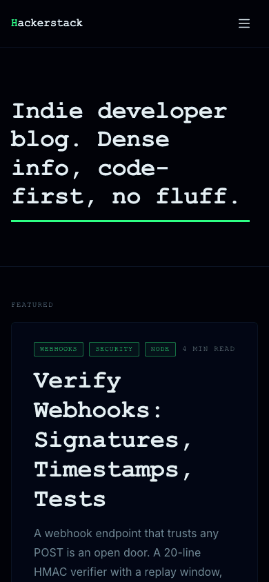
Hackerstack styles a blog the way developer tools style their docs. The page is deep navy, headlines are set in a monospaced face, and a single neon-green rule underlines the hero, which is simply your site description in large type. Under it, your newest post gets a wide featured card and the next four sit in a two-column grid of outlined cards with tag chips and reading times.
Who it's for
Hackerstack fits engineers writing about the systems they build, indie makers keeping a build log beside the product they sell, and small developer-tool teams who want the blog to feel like part of the product. It leans on type rather than photography: the home page has no hero image, and the post cards there carry no thumbnails. If your posts depend on a big picture up front, or your readers expect a white page, look elsewhere, because this theme comes in dark only.
What makes it different
Your description as the headline
The home hero holds one thing: your site description, set large in the heading font with a thick underline in the primary colour. Leave the description empty and a stock line about engineering fills in. In the nav, the first letter of your blog name takes the primary colour, or your uploaded logo replaces the wordmark.
One featured post, then four more
The newest post fills a wide featured card with up to three tag chips, its reading time, the excerpt, the date and a read link. Posts two to five follow in a two-column grid that becomes a single column on narrow screens. Hovering any card lights its outline green and tints the title.
A narrow column for long technical posts
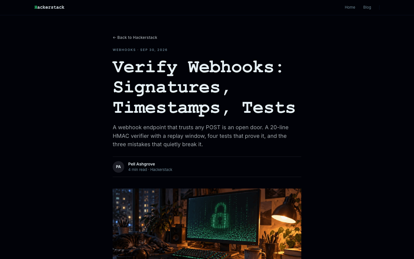
Articles sit in a column about 720 pixels wide: a back link, the first tag and date, headline, excerpt, an initials byline with reading time, then a 16:9 cover. A post with no cover gets a dark-to-amber gradient in that slot. Tags link to a filtered blog listing, and comments close the page.
Signup that waits until it can work
An outlined Subscribe button sits in the nav and in the mobile drawer, and a Keep reading box with an email field ends each post. Neither appears until a newsletter or membership is set up and the subscribe widget setting is on, so a fresh site never shows a form that leads nowhere.
A storefront with amber badges
Shop cards run three across on wide screens, two on tablets and one on phones. Each shows a 16:10 image that swaps to a second picture on hover when you add one, an amber category badge, the title and a monospace price in the primary colour. Simple products get an outlined add-to-cart button once payments are connected.
Product detail without the clutter
A product page opens with a link back to the shop, a 4:3 image above a scrolling strip of thumbnails, then the title, tagline and a large monospace price. Below the buttons come the description, a feature list marked with ticks and an FAQ whose questions open on click. Sold-out items show an out-of-stock label instead of buttons.
Page by page
- Home
- Description as the hero headline, one featured card, a two-column grid of four more posts and a darker footer.
- Blog
- An index headed by your blog name, category filters, image cards three across and page numbers.
- Post
- Narrow reading column, initials byline, cover or gradient, linked tags, a signup box when enabled, comments.
- Page
- Page-builder blocks in the same narrow column as articles, under an eyebrow, title and short intro.
- Shop
- Three-column card grid with a search box, amber category chips and hover images.
- Product
- Image with thumbnail strip, monospace price, ticked feature list and a click-to-open FAQ.
Customizing it
Switch on Apply my brand to the whole site theme in Global Design and Hackerstack takes your background, text, secondary (muted text) and neutral (border) colours. Your primary colour replaces the neon green in text, and in rules and outlines too unless you also set an accent colour, which then takes those over and recolours the amber category chips. A new background also retints the cards, while the footer keeps its navy. Heading and body fonts replace the monospaced headings and the Inter body text; code and prices keep their monospaced face, and corner radius stays fixed.
Honest limits
- Dark only. The stylesheet has one navy palette and no light variant or rule that follows the visitor's system colour setting.
- A few green details are written into the stylesheet rather than tied to your primary colour: the Subscribe button outline, the tag chips on home cards, the glow when you hover those cards and the shop card hover border. The amber tint behind category chips and the gradient on posts without a cover are fixed as well.
- The home page shows only your five newest posts, with no link to older ones in its body. Readers reach the rest through the Blog link in the menu or footer.
- The blog listing has no search box, and the shop narrows products only by search text and category, with no price or stock filters.
- Inline code and code blocks inside posts use a neutral tinted panel in a monospaced face. The theme does not paint them amber or give them a special navy code slab.
Specifications
- Category
- Developer
- Price
- Included
- Plan availability
- Included in every VeloCMS plan
- Commerce-ready
- Yes
- Motion
- No
Good fit for
Frequently asked questions
Does Hackerstack have a light mode?
No. It ships one navy palette with no light version and no switch for the visitor's system preference. Global Design can change the background and text colours, but the footer keeps its own dark navy.
How does code look in a post?
Inline code sits on a faint tint of the text colour in a monospaced face, and code blocks get a thin bordered panel that scrolls sideways when a line runs long. Headlines stay monospaced unless you choose another heading font.
Can my menu have sub-items?
Yes. When a top-level link has children, the desktop nav turns it into a dropdown drawn on the navy card colour. In the mobile drawer the whole tree is shown already expanded, with each level indented beneath its parent.
What do the 404 and sign-in pages look like?
They carry the developer-tool styling through. Each opens with a small shell-style chip: a dollar sign in the primary colour followed by the status code on the 404 page, New Session on sign-in and Activate Plan on the subscribe page. The 404 heading gets the same thick underline as the home hero.
Can I sell products with Hackerstack?
Yes. It has its own shop grid and product page, with search, category chips, hover images, add-to-cart buttons and an FAQ block, all in the same navy and green styling as the blog.