Editorial Noir
A near-black newsroom front page with condensed headlines and a single crimson thread.
Editorial Noir sets your site in a darkened newsroom. Your latest story fills a headline strip in condensed uppercase type with a photograph blending into the panel beside it, a thin crimson line marks the section below, and the next eight posts stack as text-only dispatches. Body copy is a serif on near-black, with dates and labels in a monospaced face.
Who it's for
It was drawn for reporting that rewards a slow read: investigative pieces, true crime write-ups, longform features and serialised noir fiction. Writers who publish fewer, heavier stories will find the stacked list suits them, because each dispatch gets its own headline, excerpt and author credit rather than a thumbnail. Newsletter writers can collect addresses beneath every article. Pass on it if your posts rely on photographs to pull readers in, since only the lead story shows an image on the front page, or if your brand calls for a bright, airy look.
What makes it different
A headline strip for the lead story
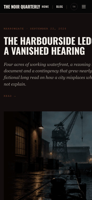
The newest post opens the home page in a two-column strip: a mono kicker with tag and date, the title in uppercase Oswald at up to 72 pixels, an italic excerpt and a Read link. Beside it sits the cover, or your site hero image if set, slightly desaturated. With no posts yet, your blog name and description stand in.
Dispatches without thumbnails
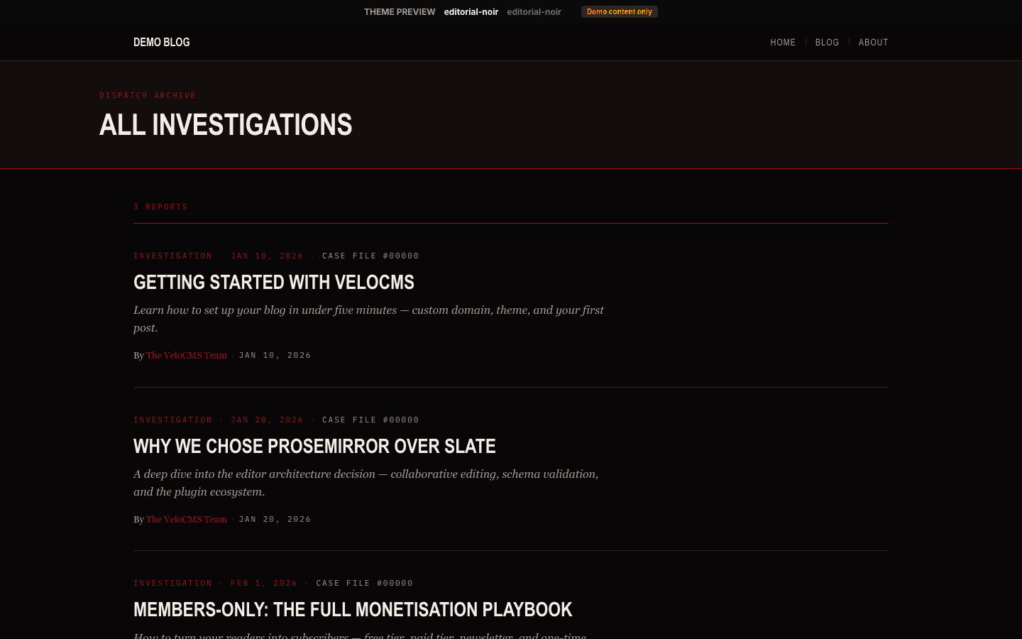
Below a Latest Dispatches label and a crimson hairline, posts two to nine stack in a single column. Each carries a kicker with tag, date and reading time, an uppercase headline that turns crimson on hover, an italic excerpt clipped at two lines and an author credit, with a rule drawn between entries.
An archive you can search and filter
The blog index heads the page with your blog name and description, then category pills when you have categories, and a search box. Posts appear as cards in three columns, dropping to two and then one on narrower screens, with numbered pagination and previous and next links underneath.
Articles that end with a sign-up
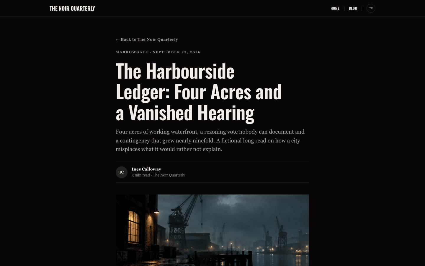
An article opens with a back link, a tag and date line, a large headline, the excerpt as a standfirst and a byline with initials and reading time. After the body come tag labels, a Keep reading box with an email field, and comments. The box needs a signup path and the subscribe widget setting on.
A storefront in the same ink
The shop heading shows a result count in a crimson mono line above an uppercase title and a short crimson bar. Search is a square input, category chips fill crimson when active, and cards list category, title, a trimmed description and price. Titles turn crimson on hover, and a second product image fades in if you add one.
Pipes, dropdowns and a side drawer
In the sticky desktop bar a flat menu is split by pipe characters; add child items and parents open square-cornered dropdowns, up to three levels deep. Below 1024 pixels a 320-pixel drawer opens from the reading-start edge with a Sections list, an account row, a cart row on stores, a Subscribe button when signup is on and a footnote.
Page by page
- Home
- Lead-story headline strip, eight stacked text dispatches, and an End footer with social links and up to four menu links.
- Blog
- Searchable card archive with category pills and numbered pagination.
- Post
- Standfirst, initials byline, desaturated cover, plugin slots, tag labels, a Keep reading sign-up when enabled, and comments.
- Page
- Eyebrow, large title and standfirst above page-builder content in a 720-pixel column.
- Shop
- Centred heading, square search, crimson-fill category chips and a three-column grid with add-to-cart on simple products.
- Product
- Gallery with a thumbnail strip, uppercase title, price, cart and buy buttons, a feature list and a question accordion.
Customizing it
Turn on apply-to-theme in Global Design and Editorial Noir picks up your brand palette: the background, the main text colour, a secondary tone for captions and bylines, the neutral used for hairlines, and a primary colour that takes over from crimson. For kickers, author names and hover text the theme uses a legibility-adjusted shade of that primary, worked out for you. Heading and body fonts can be swapped as well. The charcoal panels behind the hero and footer keep their own tones.
Honest limits
- It is dark only. The stylesheet defines one near-black palette, with no light variant and no rule that follows a visitor's system colour preference.
- When a post has no cover image, the article shows a fixed black-and-crimson gradient in its place, and that gradient stays red even after you change the accent colour.
- The home page shows the lead story plus eight more posts, with no pagination or filters, and only the headline strip carries a picture there. Older posts are reached through the blog archive.
- Tags under an article are plain labels, not links, so they do not open a filtered listing.
- The monospaced face used for dates, kickers and the shop search is fixed. Global Design changes only the heading and body fonts.
Specifications
- Category
- Investigative
- Price
- Included
- Plan availability
- Included in every VeloCMS plan
- Commerce-ready
- Yes
- Motion
- No
Good fit for
Frequently asked questions
Is there a light version of Editorial Noir?
No. It ships a single dark palette. You could lighten the background and text through Global Design, but the hero panel and footer keep their fixed charcoal tones, so a pale scheme will look uneven.
Why do the posts on my home page have no images?
The front page is meant to read like type on newsprint. Only the headline strip carries a picture: the lead story's cover, or your site hero image if one is set. The eight dispatches under it are text only, while the blog archive shows cover images on its cards.
Can I swap the crimson for another colour?
Yes. Set a primary colour in Global Design with apply-to-theme on. It replaces crimson on the hairline rules, the active shop chip and the cart button hover, and a readable shade of it is used for kickers and author names. The gradient that stands in for a missing article cover stays red.
Where can readers subscribe?
In two places: the Keep reading box under each article and the Subscribe button in the mobile drawer. Both appear only when a newsletter or membership signup is set up and the subscribe widget setting is on. The home page has no sign-up form of its own.
Can I sell products with it?
Yes. The theme has its own shop and product layouts, with search, category chips, hover images, a cart button on products without options once a payment method is connected, and a gallery, feature list and question accordion on product pages. Products with options link to their detail page instead of showing a cart button on the card.