Curator
A bold white-and-red magazine front page with oversized uppercase headlines.
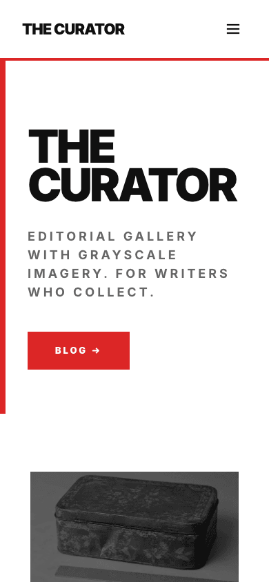
Curator is built like a print masthead. Your blog name runs across the top in huge uppercase type with a thick red bar down its left edge, two lead stories take the main grid, three compact cards sit in a row beneath, and a full-width red band repeats your tagline before a black footer closes the page.
Who it's for
Curator suits publishers who post often and want the front page to feel edited. Creators running an essay series, small agencies with an insights section, and writers who like a confident, high-contrast look will get the most from it, and it carries a shop in the same sharp style. If your voice is gentle or your brand palette is pastel, the heavy type and red accent will fight you, so reach for a calmer theme such as Minimal Dark instead.
What makes it different
A masthead, not a header
The nav sits on a thick red underline with the brand set in heavy uppercase. The hero is your blog name at a very large size, with a tagline and a button beneath it and a red bar down the left edge. There is no hero image; the type does the work.
Lead stories first
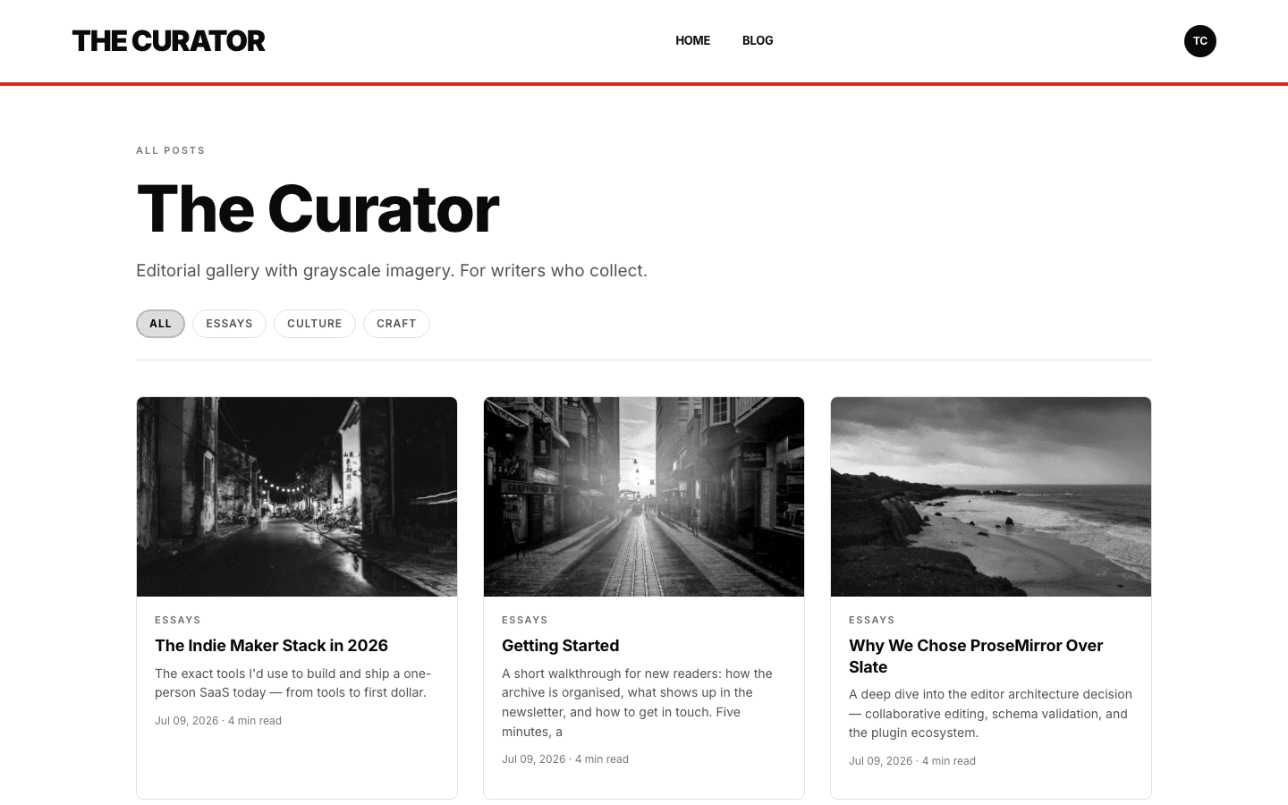
The main grid gives your two newest posts the space: a wide lead card and a narrower second card in a two-to-one split. Posts three to five follow in a compact row of three cards, each with a tag label and a heavy headline, and a card gains a dark border on hover.
A manifesto band and a sign-up
Under the cards, a full-width red band sets your tagline as a pull quote, with an About link when you have an about page. The black footer carries a large sign-up heading and an email field, and a matching box appears under each post. Both need a signup path set up and the subscribe widget setting on.
A listing and article pages
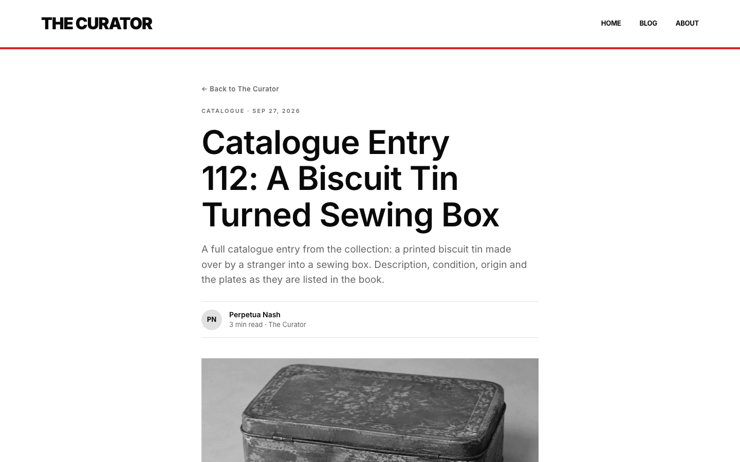
The blog index has category pills, a three-column grid and numbered pagination. Articles open with a back link, tag and date line, headline, excerpt, byline, cover and body, then tag pills that link to a filtered listing and a comments section. Plugin slots sit before and after the body.
A shop with hard edges
Shop cards are square blocks with a heavy uppercase title, a red category label and a bold price. Product images start in grayscale and darkened and regain colour on hover, along with a second image if the product has one. Search is a square input, and categories are uppercase chips.
Menus that can nest
The nav supports nested menus. Give an item children and it opens as a dropdown on desktop and a tree in the mobile drawer, up to three levels deep. Without a menu of your own, a new site starts with Home and Blog links, plus Shop if you sell products.
Page by page
- Home
- Oversized masthead hero, a two-to-one lead grid, a row of three cards, a red manifesto band and a black footer.
- Blog
- Category pills, a three-column grid and numbered pagination.
- Post
- Byline, cover, tag pills linking to filtered listings, a newsletter box when signup is on, and comments.
- Page
- Page-builder content inside the same nav and footer.
- Shop
- Square product cards, search and uppercase category chips.
- Product
- Gallery, heavy uppercase title, a red add-to-cart block and an outlined buy button.
Customizing it
Under Appearance, Global Design controls Curator's background, text and accent colours and its font, once apply-to-theme is on. The accent is the red used for the nav rule, the hero bar, the manifesto band and the active shop pill, so changing it recolours all of them together. Corner radius is not themeable, and the footer stays black. Menus are managed under Navigation.
Honest limits
- It is light only. The palette is white and black with one accent, and the CSS has no dark variant or system colour-scheme switch.
- Post images on home-page cards are shown in grayscale and darkened, and hovering a card scales the image without restoring its colour. Shop cards do regain colour on hover.
- The blog listing has category pills and pagination but no search box.
Specifications
- Category
- Magazine
- Price
- Included
- Plan availability
- Included in every VeloCMS plan
- Commerce-ready
- Yes
- Motion
- No
Frequently asked questions
Does Curator have a dark mode?
No. It has one white-and-black palette and no dark variant or system-preference switch. The footer is black by design, and you can recolour the rest through Global Design.
Why do my post images look grey?
The theme styles home-page card images in grayscale and darkened as part of its look. On shop cards the colour returns on hover. On home-page cards the image stays muted, so pick cover images that still read well in grey.
Can I change the red accent?
Yes. Set your primary colour in Global Design with apply-to-theme on, and the nav rule, hero bar, manifesto band and active shop pill follow it.
Can I sell products with Curator?
Yes. It has its own shop and product layouts with search, category chips, hover images and add-to-cart buttons, drawn with the same square, high-contrast blocks as the blog.