Manifesto Black
A pamphlet-style front page in black, bone and red for writers with an argument.
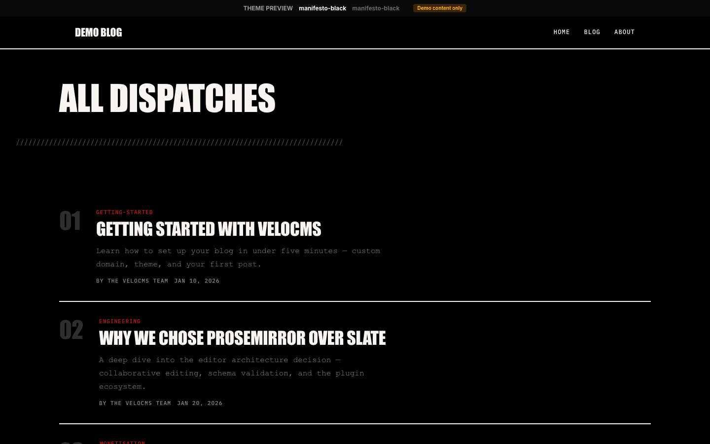
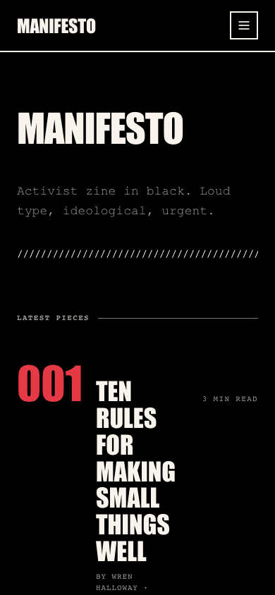
Manifesto Black prints your site like a cheap, loud pamphlet. The home page carries no photographs at all: your site name runs in condensed capitals at up to 128 pixels, a row of slashes rules it off, and your four newest pieces follow as numbered entries, 001 to 004, each a red numeral beside an uppercase headline. A vermillion band then reprints the newest piece's excerpt in large type.
Who it's for
It suits writers whose work is an argument: columnists, campaigners, organisers publishing statements, small independent news outlets and zine makers. Because the home page is text only, it rewards sharp headlines and short excerpts rather than photography. It is a poor match if you want a light theme out of the box, a picture-led front page, or a home page listing more than four posts; the last two are fixed in the layout.
What makes it different
A front page made only of type
There is no hero image slot. The home page sets your site name as the headline with your description beneath it, then a line of slashes. Each of the four newest posts becomes a row: a three-digit red number, the title in capitals, the author and a Filed date, and the reading time on the right.
The red band
Below that list, a full-width band in the primary colour reprints the newest post's excerpt, or its title when there is no excerpt, in capitals up to 64 pixels, under a Featured label and above the author's name. Its text is black rather than bone, which clears the WCAG AA contrast ratio on the default red.
Signatories, pledges and a missing entry
The secondary screens keep the pamphlet vocabulary. Sign-in carries a Signatory Access label beside a red № mark, with the form in a hard-edged near-black card. The subscribe page is labelled Pledge Your Support. The 404 page shows a huge red 404 numeral, a heavy rule, a giant capital headline and two square-cornered buttons.
Signup only where it can work
When a newsletter or membership is set up and the subscribe widget setting is on, a Subscribe link joins the desktop menu for signed-out readers, a red Subscribe block sits at the foot of the mobile drawer, and each article ends with a Keep reading box whose email field signs readers up directly. Otherwise none of the three appear.
A shop laid out as a ledger
Products are listed one per row between 2px rules: an 80-pixel thumbnail, or a red running number when a product has no image, then its category, a capitalised title and the price. A search box, category pills, a minimum and maximum price and an in-stock checkbox sit above the list.
Menus with sub-items
Nested menu items open as square black dropdowns on desktop. On phones a drawer up to 320 pixels wide opens from the side. A flat menu is set in large condensed capitals, numbered 01, 02, with the current section in red; a nested one lists every sub-item expanded and indented. Account and cart rows sit at its foot.
Page by page
- Home
- Site name in giant capitals, your description, a slash rule, four numbered text-only entries and a red excerpt band.
- Blog
- Your site name as heading, category pills, a three-column card grid with grey placeholders for missing images, and page numbers.
- Post
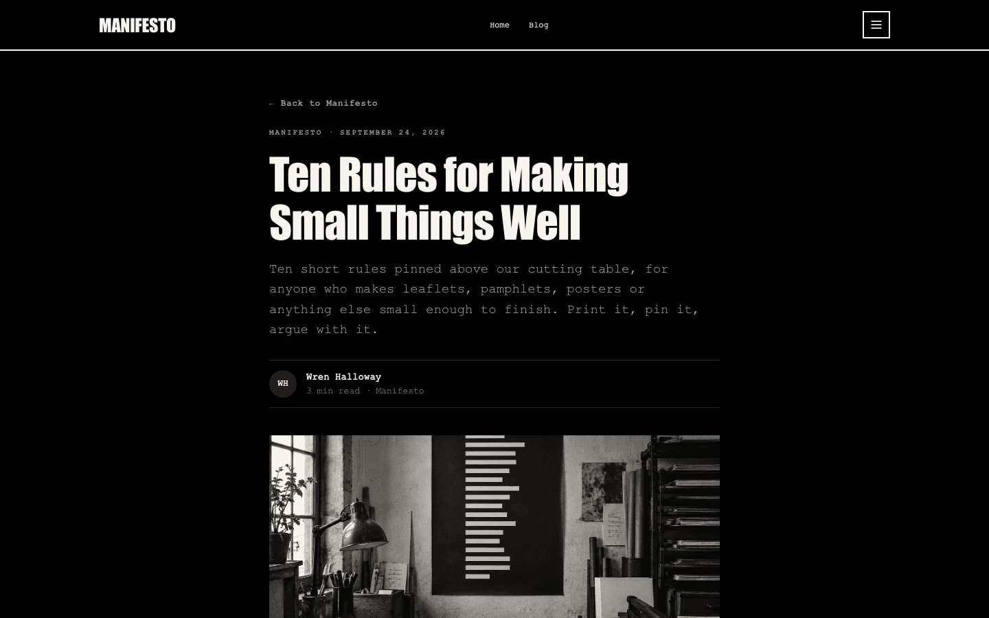
- Tag and date eyebrow, excerpt as standfirst, initials byline, cover or a black and red gradient, linked tags, signup box and comments.
- Page
- Eyebrow, title and description above your page-builder content in a 720-pixel column.
- Shop
- Search, price and stock filters, category pills and one product per row, with add-to-cart on items without variants once payments are connected.
- Product
- Capitalised title, a 16:9 gallery with thumbnails, price, add-to-cart, a Stripe buy button and a question accordion.
Customizing it
With Apply my brand to the whole site theme on in Global Design, your background colour replaces the black, your text colour the bone, a text-safe secondary the grey meta lines, neutral the heavy 2px rules, and primary the red band, active shop pills and buttons (accent takes those over if you changed it too). Home page numerals and menu link hovers use a text-safe primary. Your heading and body fonts replace the condensed capitals and typewriter face; the small monospaced labels keep theirs. The black and red cover fallback and the faint row hover tint stay fixed.
Honest limits
- It is dark only, with no light palette and no response to the visitor's colour-scheme setting. Global Design can lighten it, but a few fixed touches, such as the black and red article cover fallback, will not follow.
- The home page shows at most four posts, without images, and the list has no link to older work; readers reach the archive through your menu. The newest post appears twice, once in the list and again in the red band.
- Articles and the blog archive lose the hard edge of the home page: archive cards have 8-pixel rounded corners, filters and tags are pill-shaped, avatars are circles and the article signup box is rounded.
- If no payment method is connected, the product page shows the Out of stock label where the buy buttons would be, even for items you have in stock. The shop has no wishlist button.
- Labels such as Latest Pieces, Featured, Signatory Access and the drawer's Print run limited footnote are fixed app translations, not per-site settings. There is no on-page motion control, and with reduced motion requested, blog cards still shift up on hover, only without the animation.
Specifications
- Category
- News
- Price
- Included
- Plan availability
- Included in every VeloCMS plan
- Commerce-ready
- Yes
- Motion
- No
Good fit for
Frequently asked questions
Why is there no picture on the Manifesto Black home page?
That is deliberate. The home layout ignores the hero image setting and shows no post covers, so the page is all type. Images do appear on blog archive cards, at the top of each article, and in the shop and product pages.
Can I swap the vermillion for my own colour?
Yes. Turn on Apply my brand to the whole site theme in Global Design and your primary colour takes over the band, buttons and active shop pills, or your accent colour if you have changed that as well. The home page numerals and menu link hovers use a text-safe version of primary, and text on the band switches to white or near-black, whichever reads better on your primary.
Will it read properly in Arabic?
The theme's own labels, such as Signatory Access, Pledge Your Support and the drawer footnote, have Arabic translations, and the mobile drawer opens from the inline start edge, so on a right-to-left site it comes in from the right.
Can I sell pamphlets, prints or badges?
Yes. The shop and product pages are part of the theme. Listing rows show add-to-cart for products without variants once a payment method is connected, and products with variants link through so the buyer can pick one. The product page adds a separate buy button only when Stripe is connected.
Does anything move?
Very little, and nothing plays on its own. Links change colour on hover, home and shop rows take a faint tint, blog archive cards rise two pixels, and desktop dropdowns fade in briefly unless reduced motion is requested. The mobile drawer appears without a slide.