Velvet Editorial
A cream-and-burgundy magazine cover, portrait grids and an oversized pull-quote.
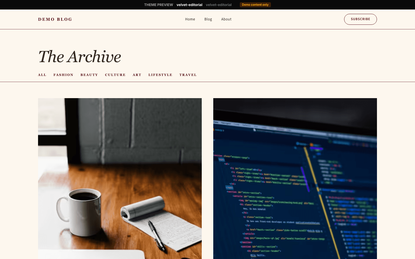
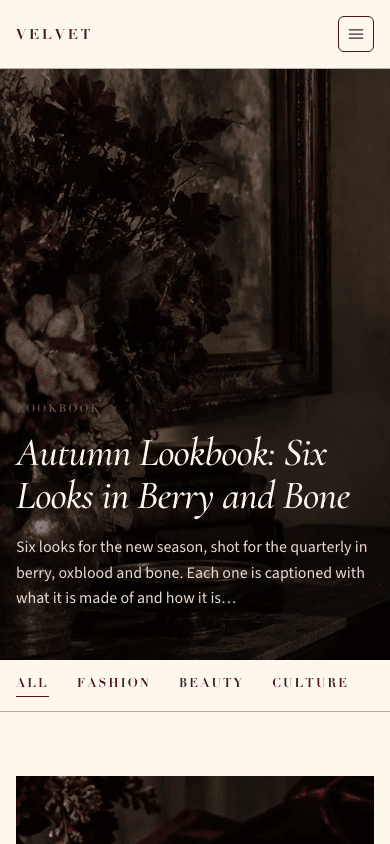
Velvet Editorial lays a blog out like the pages of a glossy. A sticky, frosted header carries a spaced capital wordmark in burgundy; the home page opens on a tall cover story with the headline in large Cormorant Garamond italics; and below it come tall portrait cards, a giant quotation drawn from your site description, and a row of four smaller stories.
Who it's for
It is made for publishers who think in spreads: fashion and beauty editors, art and film reviewers, stylists, photographers with an editorial voice and high-end lifestyle bloggers. Because the layout relies on tall crops, it rewards sites that shoot or commission portrait imagery for most posts. It is a poor match for dense technical writing, for sites that want a dark palette, or for anyone who needs a plain list of dozens of posts on the home page, which shows seven stories at most.
What makes it different
A cover story at seventy per cent of the screen
The hero fills 70 per cent of the viewport height, between 500 and 760 pixels. It uses your hero image or else your newest post's picture, darkened by a gradient so the text reads. A blush tag, an italic headline up to 88 pixels and a 140-character deck sit on it. Without an image, a burgundy-to-cream gradient stands in.
Portrait cards, then a quotation, then four more
Under the cover come two cards cropped 2:3, then your site description enlarged into a centred italic quotation between hairlines, with a 120-pixel opening mark and your site name as the credit. A final row of four 3:4 cards follows. Each card shows a burgundy caps tag, an italic title and a date.
A newsletter band and a four-column footer
When a newsletter or membership is configured and the subscribe widget setting is on, a tinted band headed The Newsletter offers a burgundy Subscribe Free button above the footer. The footer has up to four columns: site name and tagline, social links with RSS, up to six categories, and a newsletter prompt.
A sticky header that gives way to a drawer
The header is 68 pixels tall, translucent cream with a blur, and stays pinned while you scroll. A menu item with children opens a dropdown on desktop. Below 1280 pixels the links hide behind a bordered hamburger that opens a 340-pixel panel with large italic links, an account row, a cart row on shops and a Subscribe Free pill.
A shop dressed as a lookbook
The shop opens on a Collection label and a very large italic title, then a category rail, a search field and price and stock filters. Products fill the same three-column card grid as the blog, with a second image crossfading in on hover, a category tag, a 100-character description and a burgundy price.
Product pages laid out as a spread
A product splits in two: a 3:4 portrait gallery with thumbnails on one side, and on the other a blush tagline, an italic title up to 60 pixels, the price and, for a long description, a short excerpt of it. Below sit the full text, a tinted band of features, a quotation-marked buy block and the questions.
Page by page
- Home
- A tall cover story, a category rail, two portrait cards, an oversized quotation, four smaller cards, the newsletter band and a footer of up to four columns.
- Blog
- Eyebrow, site name in large type, description, rounded filters and a three-column card grid with page numbers.
- Post
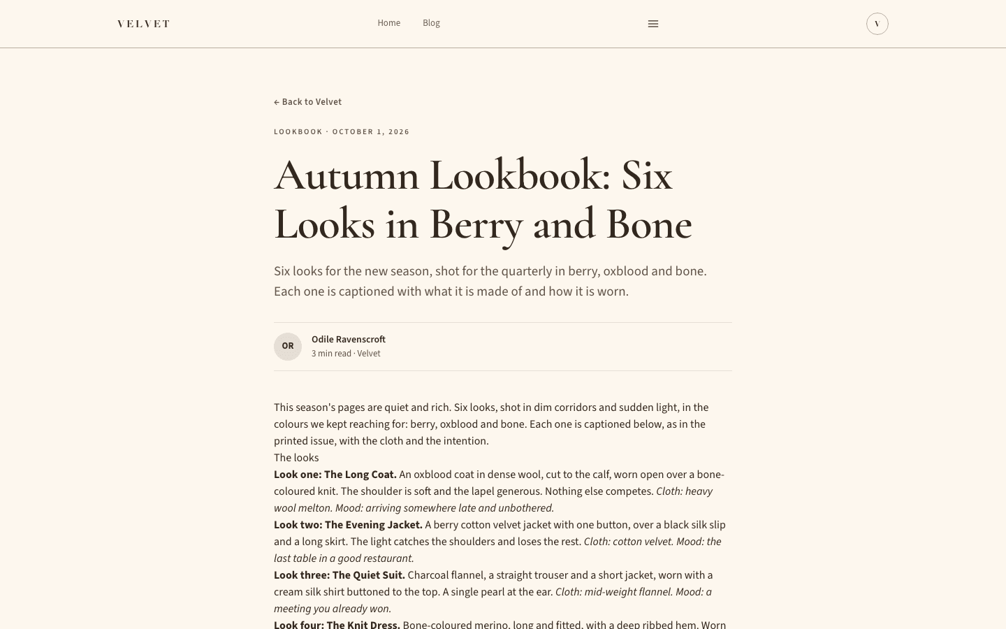
- Back link, tag and date, an italic serif title, the excerpt as standfirst, an initials byline, a 16:9 cover, tag pills, an inline subscribe form and comments.
- Page
- An eyebrow, serif title and standfirst above your content in a 720-pixel prose column between the header and four-column footer.
- Shop
- A Collection label, an oversized italic title, category rail, search, facets and a three-column product grid.
- Product
- A two-column spread with portrait gallery and buy details, then description, features, a buy block and questions.
Customizing it
With Global Design applied to the theme, your background and text colours replace the cream and taupe, your primary colour replaces burgundy on the wordmark, rail, labels and buttons, and your accent colour replaces blush on the cover tag and quotation mark. Secondary and neutral colours set muted text and hairlines, and chosen heading and body fonts replace the defaults. The tinted surface band, hover shade and capital label face are fixed.
Honest limits
- No dark variant: the stylesheet holds one cream palette and nothing that follows a visitor's dark-mode or reduced-motion setting.
- The home page shows seven stories at most, one cover, two portrait cards and four small ones. A post with no image gets a tinted gradient in its place, so a text-heavy site looks sparse here.
- Several labels are written in English inside the theme: The Newsletter and its headline, the Collection label in the shop, What's included on products, Next under the blog index, the Editorial fallback tag and the comment count.
- Tablets held sideways, up to 1279 pixels wide, get the hamburger rather than the desktop header, because long menus overflowed the bar. The drawer prints sub-items as equal links without nesting.
- On the home page the first item of the category rail is always underlined as active, and the rail disappears altogether when the site has no categories.
- The label and body faces are requested by family name, not through the platform's bundled fonts, so without your own choice in Global Design a device lacking them substitutes Georgia or a system sans.
Specifications
- Category
- Fashion
- Price
- Included
- Plan availability
- Included in every VeloCMS plan
- Commerce-ready
- Yes
- Motion
- No
Good fit for
Frequently asked questions
Which picture does the cover use?
The hero image from your site settings if you have set one, otherwise the image of your newest post. If neither exists the cover is a burgundy-to-cream gradient. The headline and deck always come from the newest post, so a mismatched hero image still reads sensibly.
How many posts can the home page hold?
Seven: the cover story, two large portrait cards and four small cards. Everything older lives on the blog index, reachable from the menu or the category rail, which lists posts three across with filters by category.
Can I hide the newsletter band?
Yes. It is drawn only when a newsletter or membership is set up and the subscribe widget setting is on. Without that the band, the header Subscribe button, the footer column and the form after articles all disappear together.
Does Velvet Editorial support a shop?
Yes, with its own listing and product page. Add-to-cart buttons appear once a payment method is connected, products with variants open a separate page to choose options, and a Stripe-connected store gets a direct checkout button.
Why does my menu collapse on a large tablet?
The theme switches to the hamburger below 1280 pixels so that a seven-link menu next to a wide capital wordmark cannot overflow. Desktop screens at or above that width show the full header, with dropdowns for any items that have children.