Brutalist Architecture
A blog drawn like a set of building plans, in concrete grey and rebar orange.
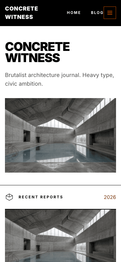
Brutalist Architecture borrows from the buildings, not the web trend. Your site name is set in huge black capitals, the newest post's cover fills a wide 16:9 slab below it, and a small axonometric cube marks where the recent reports begin. Surfaces are a warm concrete grey, rules are thick and black, and photographs on the home page and in the shop are pulled partway towards greyscale.
Who it's for
It suits people who write about the built environment: architecture critics, urbanism researchers, planners and photographers who document buildings. The home page works best when each post has a strong cover image, because the newest one is shown twice, once as the wide slab and again inside the lead card. If you publish books, prints or field guides, the shop carries the same concrete cards and caps titles, and product pages keep the caps headings. It is a poor fit for a site that needs a long, busy front page or full-colour imagery.
What makes it different
Site name as a facade
The home page opens with your site name in uppercase black type that scales up to 112 pixels, your description underneath in grey, and then a 16:9 slab. That slab shows the cover of your most recent post, desaturated, or a concrete gradient when that post has no cover.
Lead card and a checkerboard of two
Below a cube-drawing divider labelled Recent Reports, with the current year in orange, the newest post sits in a concrete card split seven to five between picture and text. The next two posts follow in a two-by-two grid that alternates image and text blocks, each boxed in a 2px black border.
Photography in muted tones
Covers on the home page are filtered to roughly half greyscale with a slight contrast lift, product cards are toned down in the same way, and the product gallery a little less. Colour pictures read like weathered prints, so a set of building photos looks consistent even when shot in different light.
A shop titled Catalogue
The shop opens with an orange cube outline and the word Catalogue above a large uppercase heading. Visitors can search, pick a category, set a minimum and maximum price and tick in-stock only. Cards are concrete with a black hairline that turns orange on hover, and an empty shop says Site Not Yet Poured.
Product pages with drawing captions
Each product starts with a small monospace caption, fig. 1 — catalogue entry, then the title and a 16:9 gallery whose active thumbnail gets an orange outline. Below the price come buy buttons, the description, an Included list marked with orange plus signs and product questions that open and close.
A drawer with numbered rows
An orange-outlined menu button opens a black side panel capped by a thick orange rule, and replaces the desktop links below 1024 pixels. Flat menus are numbered 01, 02, 03 in large caps, and menus with sub-items appear as a fully opened tree. On desktop, sub-items drop down in a square black panel edged in orange.
Page by page
- Home
- Name-as-headline hero, cover slab, cube divider, a lead card and two more posts in a checkerboard, then a black three-column footer.
- Blog
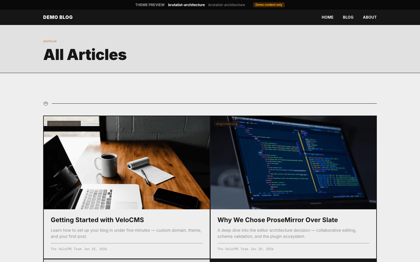
- All Posts eyebrow over your site name, category pills, a three-column card grid and numbered pages with a Next link.
- Post
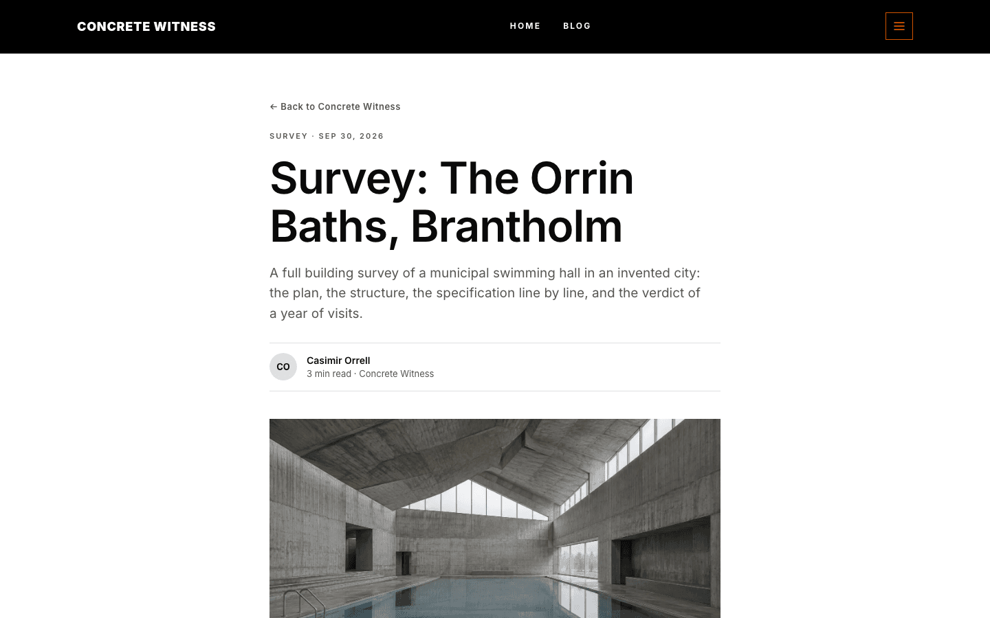
- Tag and date line, title, excerpt, initials byline, a cover or grey placeholder, tags, a gated Keep reading box and comments.
- Page
- A narrow reading column with eyebrow, title and short intro over your page content.
- Shop
- Catalogue header, search, category pills, price and stock filters, and concrete product cards.
- Product
- Monospace caption, gallery with thumbnails, price, buy buttons, Included list and FAQ.
Customizing it
With Apply my brand to the whole site theme turned on in Global Design, your background, text, primary, secondary and neutral colours replace the theme's own. Primary takes over from rebar orange on buttons, hover states and labels. Your text colour also paints headings, the nav bar and footer, so pick a dark one; their lettering stays white or light grey. The two concrete greys are fixed. One font runs throughout, your heading font first, then your body font, with Inter as the default.
Honest limits
- It is a light theme only. The stylesheet has no dark palette and does not respond to a visitor's system colour preference.
- The home page shows just three posts: the lead card and two below it. Everything older is reached through the blog listing.
- There is no setting for the hero image. The wide slab always uses the newest post's cover, and the photo filters cannot be switched off.
- The blog listing and article pages are softer than the home page, with rounded cards and pill-shaped tags instead of hard black boxes. Monospace captions appear only on product pages.
Specifications
- Category
- Architecture
- Price
- Included
- Plan availability
- Included in every VeloCMS plan
- Commerce-ready
- Yes
- Motion
- No
Frequently asked questions
Can I choose my own hero image?
No. The home page ignores a separate hero image and fills the wide slab with the cover of your latest post. If that post has no cover, a concrete-grey gradient takes its place, so publishing with a strong cover is the way to control it.
Will my colour photos stay in colour?
Only partly. Home page covers, shop cards and product galleries all pass through a greyscale and contrast filter fixed in the theme. Colour still shows through, but muted, and there is no option to turn the filter off.
Is there a dark mode?
No. The layout is built on a white page with concrete-grey cards and a black nav and footer, and the CSS has no dark variant. You can shift the colours through Global Design, but the two concrete greys stay as they are.
Can I sell books or prints with it?
Yes. The theme has its own shop listing with search and price and stock filters, and its own product page with a gallery, add-to-cart and FAQ. Products without options can be added to the cart straight from the listing once a payment method is set up.
Do I need to write about architecture to use it?
No, but the labels lean that way. The home divider reads Recent Reports, the shop calls itself a Catalogue and the mobile menu footnote talks about field reports, so the theme feels most at home on a site about buildings, cities or places.