Aperture
A near-black, image-first theme where the photograph does the talking.
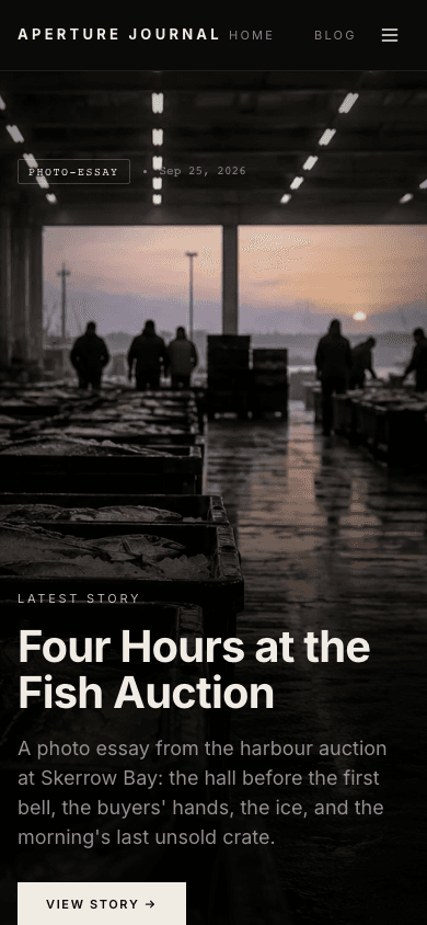
Aperture is a dark theme for photographers who publish stories. The home page opens on a full-height cover photo with the title pinned to the bottom, then a grid of six more posts that goes from muted grey to full colour on hover. Post pages can print camera and lens details under the cover image.
Who it's for
Photographers and visual storytellers who write about the work behind the pictures: travel, documentary, street, weddings, studio. It also suits a photographer who sells prints, presets or guides as digital products, because the shop and product pages share the same dark gallery look. It is a poor fit for text-heavy publications or sites that need a light palette. Aperture is built so the picture comes first and the chrome stays out of its way.
What makes it different
A full-height cover on the home page
Your newest post becomes a full-height cover with a dark overlay, a small tag-and-date badge and the title at the bottom. If you set a hero image for the site, it takes the place of that post's cover photo.
A grid that wakes up on hover
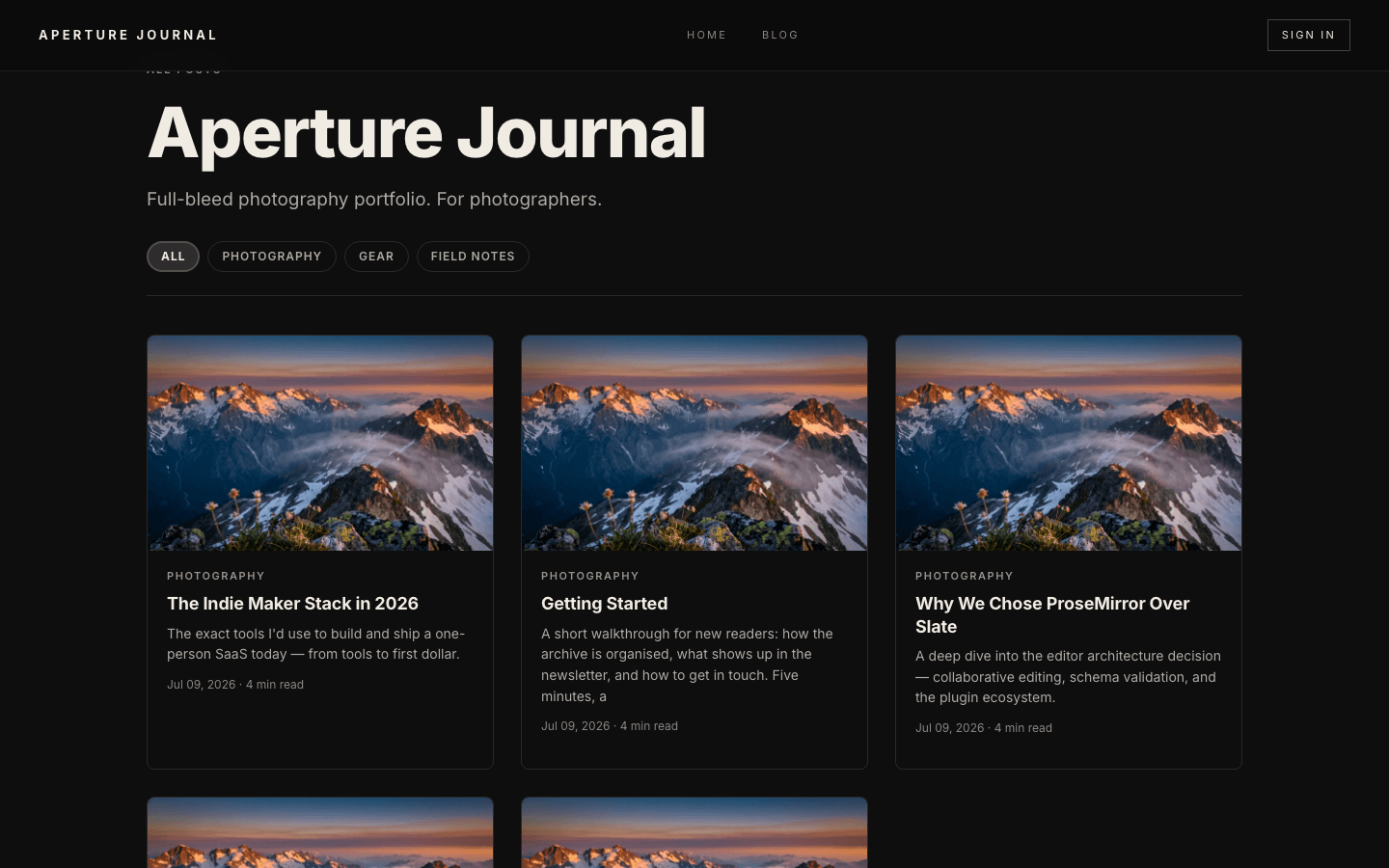
Posts one to six follow in a three-column grid that mixes tall and short tiles. The pictures sit slightly desaturated and return to full colour when you hover over them, so the grid feels quiet until someone looks closely.
EXIF under the cover photo
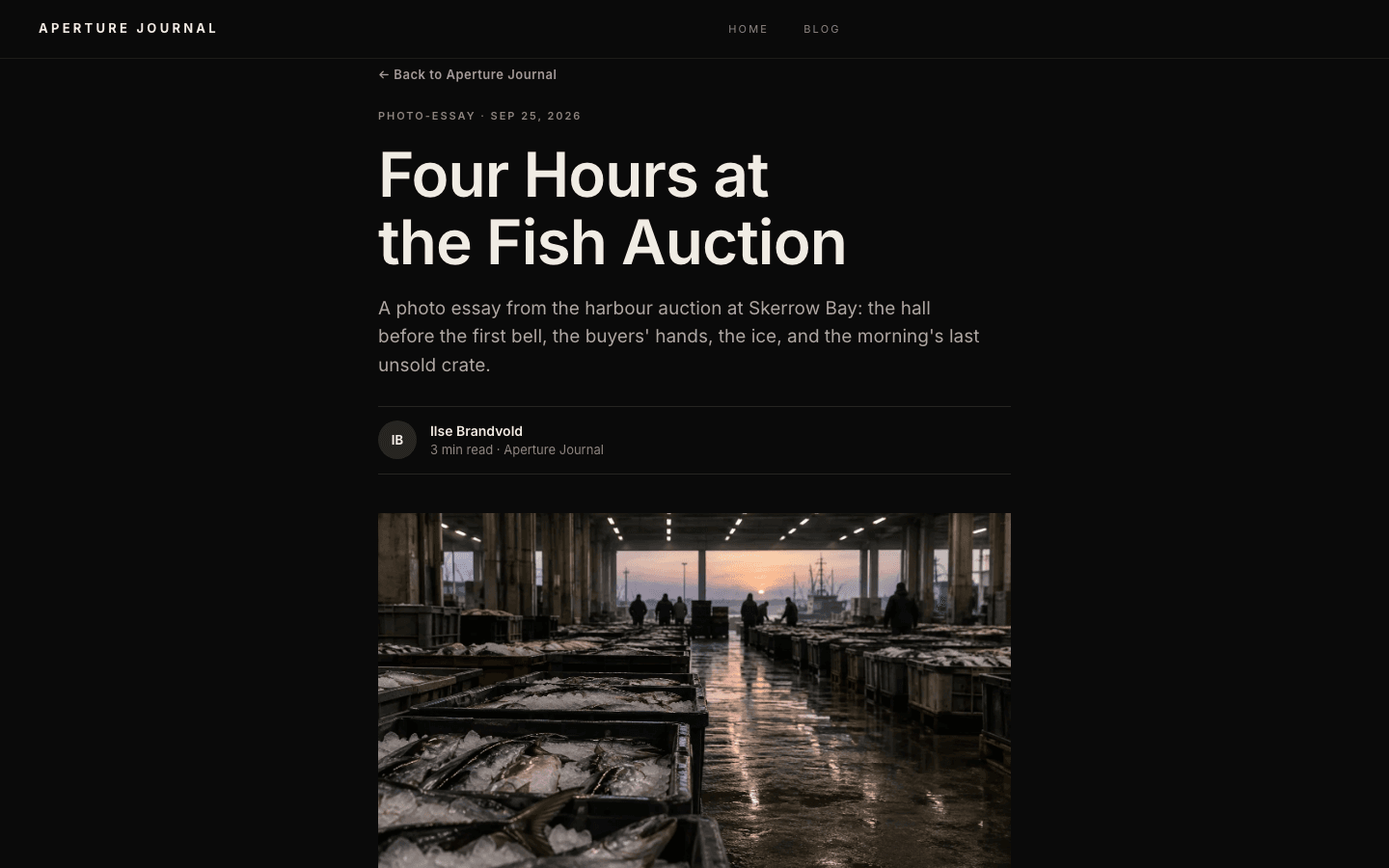
A post page can show camera, lens, aperture, shutter speed, ISO and focal length under the cover image, read from the photo's stored metadata. It works when the cover is a media-library photo, each photo has its own show-EXIF switch, and GPS is saved only when your site setting for it is on.
A shop that looks like a gallery wall
The shop listing uses large images, a small caps line for the category, a tracked-caps title and a Space Grotesk price. It has search and category pills, and a card with a second gallery image swaps to it on hover for mouse users.
Product pages in the same thin-outline style
Product detail pages have their own Aperture layout, drawn with thin outlines on the near-black ground. The buy button is hidden when a product is out of stock, and product questions open as an accordion.
Page by page
- Home
- Full-height cover from the newest post, then a six-post mixed-height grid.
- Blog
- Category filter pills, a three-column card grid and pagination.
- Post
- Cover image with optional EXIF row, then the article text.
- Page
- Page-builder content inside the same dark chrome.
- Shop
- Gallery-style listing with search and category pills.
- Product
- Thin-outline detail page with an out-of-stock state.
Customizing it
Aperture's palette is its own and it is not driven by Global Design colours: the near-black background and warm off-white text are fixed in the theme. What you control is the content and the setup. That means your site name, logo, hero image, menu, social links, which photos show EXIF and whether GPS is saved. The type is Inter, with Space Grotesk for small metadata lines.
Honest limits
- Aperture is dark only, and it is excluded from the Global Design colour bridge on purpose, so changing brand colours there will not recolour the theme.
- The home page uses one post as the cover and shows the next six in the grid. Older work lives on the blog page.
- Fonts are fixed as well: Inter, with Space Grotesk for the small metadata lines. Global Design font choices do not reach this theme.
Specifications
- Category
- Gallery
- Price
- Included
- Plan availability
- Included in every VeloCMS plan
- Commerce-ready
- Yes
- Motion
- No
Good fit for
Frequently asked questions
Does Aperture show EXIF data?
On post pages, yes, under the cover image. The cover must be a media-library photo whose EXIF was stored at upload, and each photo has a switch to show or hide it. GPS coordinates are saved only when the site-level GPS setting is on.
Can I change the colours?
Not through Global Design. Aperture keeps its own near-black palette so photographs sit on a neutral ground. If you need a coloured or light theme, pick another one.
Can I sell prints or presets with it?
You can sell digital products. The shop and product pages are themed to match. Check what the product types and checkout support before you plan a print business around it.
Does it work on phones?
Yes. It has its own mobile menu drawer and the home grid drops to two columns on tablets and one on phones. The grey-to-colour change is a hover effect, so a touch screen has no hover to trigger it and the pictures stay slightly muted.