Bauhaus Geometric
Primary-colour blocks, heavy uppercase type and black rules for writing about design.
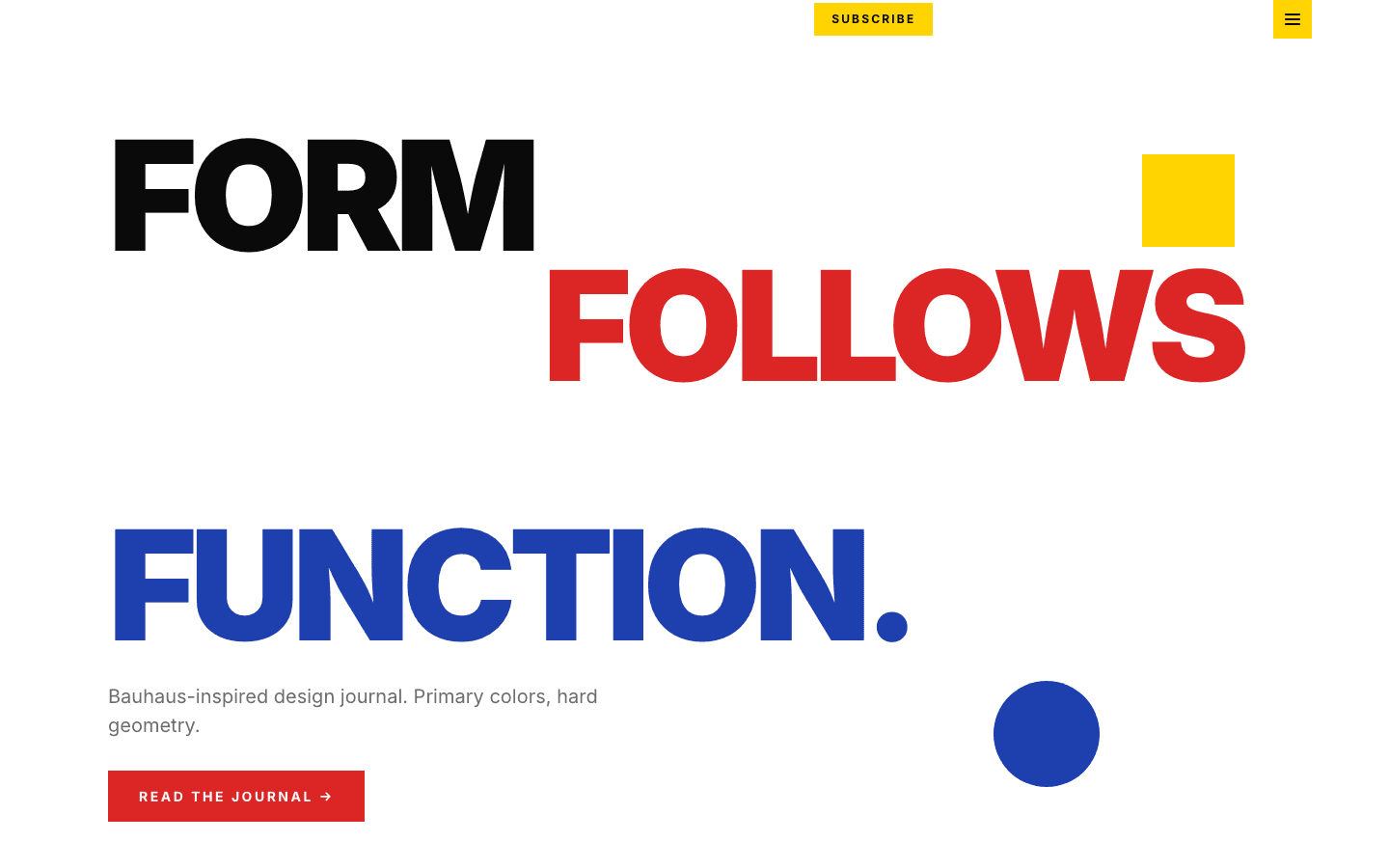
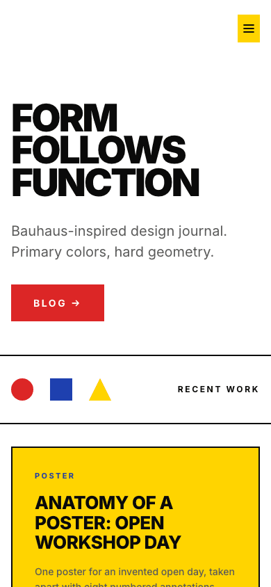
Bauhaus Geometric treats the front page like a design-school poster. Your site name is set in enormous uppercase letters, a red button leads to the blog, and a row of three flat shapes, a red circle, a blue square and a yellow triangle, introduces your recent work. Below it, posts sit in a grid of solid colour blocks framed by two-pixel black lines, and the footer stacks bands of primary colour.
Who it's for
It was drawn for people who write about how things are made and shaped: industrial and product designers keeping a studio journal, architects posting project notes, interior designers, design students documenting coursework, and historians of the modern movement. It also suits a small studio selling prints, objects or downloads, because the shop reuses the same colour blocks. The home grid is text only, with no thumbnails, so if your posts depend on a lead photograph, a picture-first theme such as Aperture will serve them better.
What makes it different
A poster where the hero would be
The opening section is your site name at up to 160 pixels, heavy and uppercase, with your site description underneath and a red button to the blog. On wide screens a yellow square and a blue circle float beside the type; below 900 pixels both disappear so the name has room.
Monolith cards in the primary triad
Your six newest posts fill a three-column grid whose cards rotate yellow, blue, red and white. Each card is pure type: the first tag as a small label, an uppercase headline, the excerpt and the date, with no thumbnail. Pointing at a card draws a thick black outline around it.
A footer in three colour bands
A yellow band, shown once you have categories, lists up to three beside your name; a blue band holds the About link; a red Connect band carries RSS, privacy and terms. With newsletter or membership set up and the subscribe widget on, Subscribe appears there, as a yellow nav button and as an email box under articles.
A plain archive and readable articles
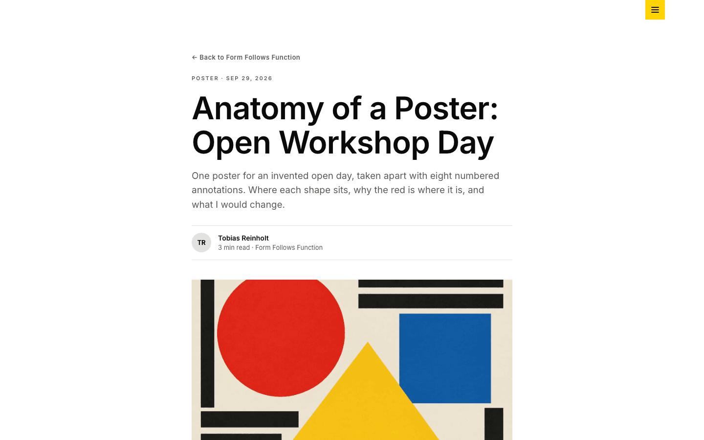
The archive has category pills, a three-column grid of cards with cover images and reading time, and numbered pagination with a Next link. Articles open with a back link, tag and date, title, excerpt, an initials byline and the cover; a post without one gets a red, blue and yellow gradient. Comments close the article.
A shop cut from the same blocks
Product cards repeat the four-colour rotation inside black rules, and a second image fades in on hover where the product has one. The listing adds search, category chips, a price range and an in-stock filter. Each product page pairs a gallery and an Included list with a yellow buying panel.
A black drawer and nested menus
A yellow square opens a black drawer from the left edge with large uppercase links; below 1024 pixels it replaces the desktop links. In a simple menu the home or blog link turns yellow while you are there. Items with children become square-cornered black dropdowns on desktop and a fully expanded tree in the drawer.
Page by page
- Home
- Giant uppercase site name, a red blog button, the circle-square-triangle divider, six colour-block cards and the banded footer.
- Blog
- Category pills, image cards with reading time in three columns, and numbered pages with a Next link.
- Post
- Tag and date line, initials byline, cover or gradient fallback, plugin slots around the body, an email box when signup is active, and comments.
- Page
- Eyebrow, title and intro line over your page-builder blocks, between the same header and banded footer.
- Shop
- Oversized title beside a yellow square, search, category chips, price and stock filters, and four-colour product cards.
- Product
- Gallery with thumbnails, description, Included list, FAQ accordion and a yellow panel with price and cart buttons.
Customizing it
Turn on Apply my brand to the whole site theme in Global Design and five of its colours follow you: background, body text, muted text, the red (your primary colour) and the blue (your accent). Body text also drives the headings, every black rule and the copyright bar. Your heading font, or your body font if no heading font is set, replaces Inter across the site. The yellow stays fixed at #FFD400, as do the three divider shapes, so a recoloured site keeps one constant hue. The corner-radius setting has no effect.
Honest limits
- It is light only. The stylesheet has no dark palette and does not respond to a visitor's system colour-scheme preference.
- Home-page cards never show images. Cover images appear only on blog archive cards and at the top of articles.
- The shop grid is fixed at three columns and the product page at a two-column split in inline styles, and the theme has no breakpoint that stacks them, so check both on a phone before you lean on them.
- Tags under an article are plain labels, not links, and the blog archive has no search box; only the shop has one.
Specifications
- Category
- Design
- Price
- Included
- Plan availability
- Included in every VeloCMS plan
- Commerce-ready
- Yes
- Motion
- No
Good fit for
Frequently asked questions
Is there a dark version of Bauhaus Geometric?
No. It ships one light palette, with no dark variant and nothing that follows the visitor's system setting. You can darken the background through Global Design, but the yellow does not change, so check text contrast if you try.
Why are there no pictures on my front page?
The home grid is type-only by design: each card shows a tag, headline, excerpt and date on a flat colour. Covers still appear on the blog archive and at the top of each article, and an article without a cover shows a red, blue and yellow gradient instead.
Does the theme avoid italics entirely?
Almost. Headings, cards, navigation and footer are upright, heavy and uppercase. The one exception is quotations inside articles: blockquotes in the post body are set in italic.
Can I sell products with it?
Yes. It has its own shop listing with search, category chips, a price range and an in-stock filter, plus a product page with a gallery, an optional FAQ accordion and, once payments are set up, an Add to cart button, with a red Buy Now button when Stripe is enabled.