Aurora Borealis
Midnight blue, a green aurora glow and mountain line drawings for cold-weather writing.
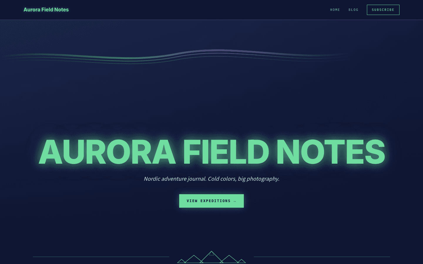
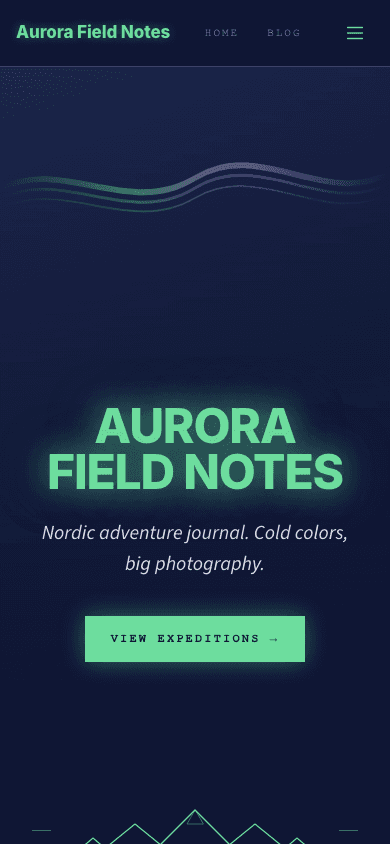
Aurora Borealis sets a blog against a midnight-blue sky. Your site name fills the hero in heavy uppercase letters with a green glow, three gradient curves arc above it like a band of northern lights, and a line drawing of peaks separates the hero from a grid of your six latest dispatches. Labels and dates appear in small mono capitals, tinted purple and glacial cyan.
Who it's for
It suits people who write from cold, dark or high places: expedition diarists, ski and mountaineering writers, Arctic and night-sky photographers, and travel bloggers whose best material arrives after sunset. If you sell prints, route guides or gear, the shop and product pages carry the same navy cards and green prices. Look elsewhere if your readers expect a bright, airy layout. It also rewards cover images: the grids are built around pictures, and a card without one shows only a colour gradient or an empty frame.
What makes it different
A glowing title beneath an aurora band
The home hero prints your site name in extra-bold Inter capitals with a soft green halo, sets your site description in italics underneath, and adds a single button that leads to the blog. Above the text, three layered strokes fade from green through purple to cyan to suggest an aurora.
Six dispatches under a mountain ridge
Below the hero, a hand-drawn ridge of five peaks sits between two thin cyan rules, then a Latest Dispatches heading opens a three-column grid of six cards. Each card holds the cover, first tag, title, excerpt and date, and its border turns green with a faint glow on hover. Unfilled slots show placeholder cards.
An archive you can sort by category
The blog page opens with an All Posts eyebrow, your site name and description, then a row of pill filters for your categories when you have any. Posts fill a three-column grid that becomes two columns on tablets and one on phones, with reading time beside each date and numbered pages below.
A narrow reading column with its own signup box
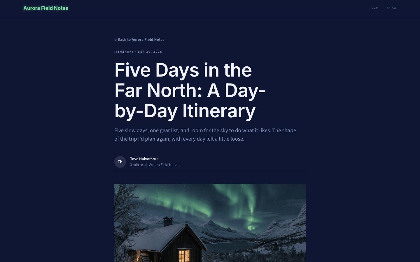
Posts sit in a 720-pixel column: a back link, a category and date line, the title, the excerpt, a byline with initials and reading time, then a wide cover. Tag pills and comments close the page, with a Keep reading signup box between them once a signup path exists and the subscribe widget is switched on.
A storefront in the same night palette
The shop starts with a Store eyebrow, a glowing green title and a search box, followed by category pills and a filter row for minimum price, maximum price and in-stock items. Cards show a cyan category label and a green price, a second picture fades in on hover, and products with options link to their own page.
Product pages laid out like a field kit
A product page puts the main image beside the tagline, title, price and buy buttons, with a thumbnail strip when there are several pictures. Further down come a description panel, a What's included checklist with green ticks, a closing buy banner and questions that fold open under a plus sign.
Page by page
- Home
- Glowing hero with the aurora band, a mountain divider, six dispatch cards and a three-column footer.
- Blog
- Category pill filters, a responsive card grid with reading times, and numbered pages.
- Post
- Byline with initials, wide cover, tag pills, a signup box when enabled, and comments.
- Page
- Eyebrow, title and intro above page-builder content, inside the same nav and footer.
- Shop
- Search, category pills, price and stock filters, and navy product cards with hover images.
- Product
- Image gallery, price, buy buttons, an included-items checklist and a folding FAQ.
Customizing it
Switch on Apply my brand to the whole site theme in Global Design and Aurora Borealis adopts your background, text, secondary text and border colours. Your primary colour takes over wherever the theme shows green, such as the brand name, buttons and hero title, and your accent replaces the cyan on dates, footer headings and divider rules. Your heading and body fonts replace the Inter headings and the default sans-serif body text. The navy card surface, the purple labels, the monospaced caption font, the aurora band and the glow halos stay as designed.
Honest limits
- Dark only. The stylesheet ships one midnight palette and never responds to a visitor's light or dark system preference.
- The hero button reads View Expeditions, untagged posts are labelled Expedition, and the footer says All Rights Reserved. These are fixed English strings that do not follow your site language.
- The home page shows at most six recent posts, with no pagination, about section or newsletter block of its own. Readers find older work through the blog page, which itself has no search field; only the shop offers one.
Specifications
- Category
- Adventure & travel
- Price
- Included
- Plan availability
- Included in every VeloCMS plan
- Commerce-ready
- Yes
- Motion
- No
Frequently asked questions
Can I give Aurora Borealis a light background?
There is no light mode. You can choose a pale background in Global Design, but the cards keep their deep navy surface and the glows stay green, so you would get dark cards on a light page rather than a light theme.
Does it support drop-down menus?
Yes. When a menu item has children, the desktop bar shows them in a square-cornered panel in the navy surface colour, and the mobile drawer lists them as an indented tree that is always open. Menus can be up to three levels deep.
Where do readers sign up?
A Subscribe button sits at the end of the nav bar and in the mobile drawer, and each post ends with a signup box. Both appear once membership or a newsletter is set up and the subscribe widget is on. Without membership, the button opens the newsletter-only signup.
Can I sell prints or route guides with it?
Yes. The theme has its own shop and product layouts with search, category and price filters, a cart icon in the nav, add-to-cart buttons and, when Stripe is connected, a buy-now button. A sold-out product shows an out-of-stock label instead of buttons.