Mise en Place
A prep-board layout for food and drink writing: numbered, labelled, in order.
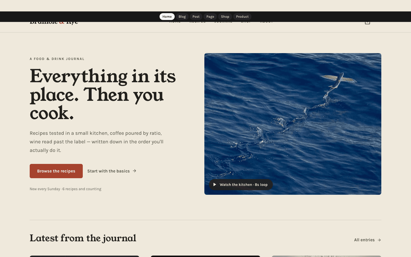
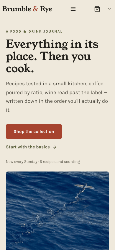
Mise en Place lays out a food and drink site the way a cook lays out a station. Young Serif carries the headlines, Karla the body text and JetBrains Mono the product notes, on a warm paper ground with olive for structure and brick red for anything you can press. A still image leads the home page, which then sets your three newest posts out twice: as a journal grid and as a numbered prep list on an olive band.
Who it's for
Written for anyone covering what goes on the plate or into the cup: recipe developers, home bakers, coffee and tea reviewers, wine and spirits writers, and cigar columnists. Its stock phrasing comes straight from the kitchen, from Browse the recipes to The Sunday prep list. A shop sits alongside for writers who also sell something of their own. It is a weaker fit for a site that wants a dark palette, a dense magazine front page, or a hero video that follows scrolling.
What makes it different
A recipe panel you switch on with a tag
Tag a post recipe and a paper-tinted panel with an olive top edge appears in a 320-pixel column beside the article, headed Ingredients above a one-line note. The panel does not read or reformat your ingredient list. It marks the entry as a recipe and leaves the quantities to your own text.
This week's mise, numbered 01 to 03
Below the three-card journal grid, an olive band titled This week's mise lays the same three newest posts out again as paper cards numbered 01, 02 and 03 in large serif numerals, each with a reading-time chip and whichever tag the post lists first. Until you publish a first post, the band stays hidden.
A still image first, an optional loop second
The hero shows your chosen hero image, else the newest post's image, else a paper-to-olive gradient. Add a video in Hero media and an MP4 plays muted and looped over it, zooming to 106 percent over ten seconds and back, with a dark Loop playing pill. Copy and picture rise 12 pixels once on load.
The Sunday prep list
If you run a newsletter or membership and Show subscribe widget on blog is on, each article finishes with an olive box: an email field plus a Subscribe button that carries the address to your subscribe page, and the phone drawer gains a tinted Subscribe Free block. The desktop header carries no subscribe button.
A shop laid out like a market table
Products line up in threes on wide screens and pairs on phones, each on a 4:5 paper plate with the serif title and price sharing one line and a short description below. A second image, when a product has one, shows on hover, and any product without variants offers add-to-cart after a payment method is connected.
Product notes set in monospace
A product page pairs a 4:5 main image and a sideways-scrolling row of thumbnails, one for every image, with a serif title and price. On products without variants, Add to cart sits next to an outlined direct-checkout button when Stripe is connected, and the feature list is printed in JetBrains Mono under About this product.
Page by page
- Home
- Still or looping hero, three latest posts, the numbered olive band and a four-column charcoal footer.
- Blog
- Journal masthead, All followed by as many as eight category pills, a grid three wide, then page numbers.
- Post
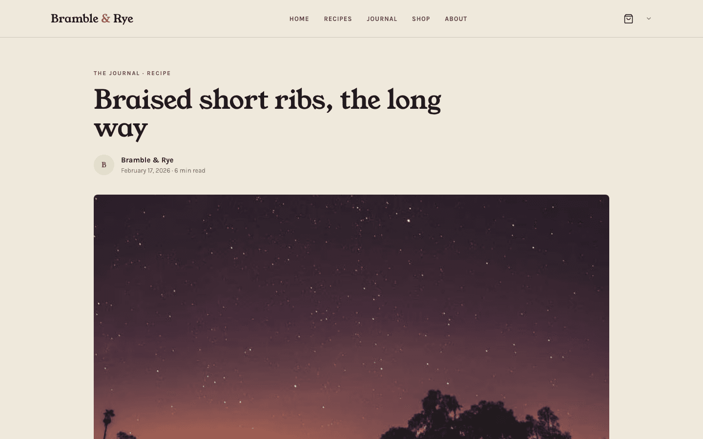
- Serif title, initial-letter byline, 16:9 cover with caption, 65-character text, optional recipe panel and listed comments.
- Page
- Olive eyebrow, serif title and a 760-pixel reading column between the sticky header and a one-row footer.
- Shop
- A count of products, category pills and 4:5 product plates, three per row, that swap images on hover.
- Product
- Breadcrumb, main image with unlimited thumbnails, serif price, buy buttons and monospaced feature rows.
Customizing it
Apply my brand to the whole site theme, a Global Design switch, hands the paper over to your background and the charcoal to your text colour, with primary covering the brick buttons, active pills and cart badge, and accent the olive band, quotation rules, recipe panel edge and newsletter box. Muted text takes a readable shade of secondary, your fonts apply too, and neutral plays no part. The hairlines, charcoal footer, the tint behind images, hover shades, menu link colour, article body colour and monospaced face stay as designed. Theme Copy edits the hero, band, newsletter and footer wording.
Honest limits
- No dark stylesheet ships with it, so the page stays light even when a visitor's device is set to dark.
- The recipe panel is a marker, not a recipe card: it shows a fixed heading and note, never your quantities or timings, and only on posts tagged recipe or carrying the theme's ingredients class. On narrow screens it drops below the article.
- The home page loads your six newest posts and shows three, which the olive band repeats. Its New every Sunday line therefore never shows a count above six; Theme Copy can replace it with fixed wording.
- Without an uploaded logo, a site name of two or more words gets a brick ampersand after its first word, so Salt Fat Kitchen reads Salt & Fat Kitchen.
- The Loop playing pill is a label, not a pause button. The clip, zoom and entrance stop only under the visitor's system reduced-motion setting; the site's own motion toggle does not reach them.
- The four-column footer appears on the home page only, and its Shop column lists your first three blog categories. Shoppers get no search, no price filter and no wishlist button on cards, and a store without payments shows an English-only notice on product pages.
Specifications
- Category
- Animation
- Price
- Included
- Plan availability
- Included in every VeloCMS plan
- Commerce-ready
- Yes
- Motion
- Yes
Frequently asked questions
Do I need a special recipe format for the Ingredients panel?
No. Add the tag recipe to a post, in any capitalisation, and the panel appears beside the text. Its heading and note can be rewritten in Theme Copy; the ingredients stay in your article.
Will my hero video follow the reader's scrolling?
No. Mise en Place reads the clip from Hero media (the Scroll journey field) and plays it as a muted, looping MP4 with a slow zoom, whatever the scroll position. Anyone with reduced motion set on their device sees the still image instead.
Can I use it for coffee, wine or cigars rather than recipes?
Yes. The Theme Copy panel in General settings rewrites the hero eyebrow, headline and buttons, the band titles, the newsletter lines and the footer tagline, in English and Arabic, and an empty field keeps the default. Labels such as The journal and Every entry, in order are not covered.
Does it suit an Arabic site?
Yes. The layouts use logical directions, so in Arabic the phone drawer opens from the right edge, arrows turn to point the reading way, and its built-in labels appear in Arabic. Theme Copy also keeps a separate Arabic version of each editable line.
Can my menu have a second level?
Yes. On desktop, a parent item opens a paper panel of its children; in the phone drawer the children are already shown, set in beneath the parent.