Workbench
A maker's journal with a small shop: forest green, bone paper and one amber line.
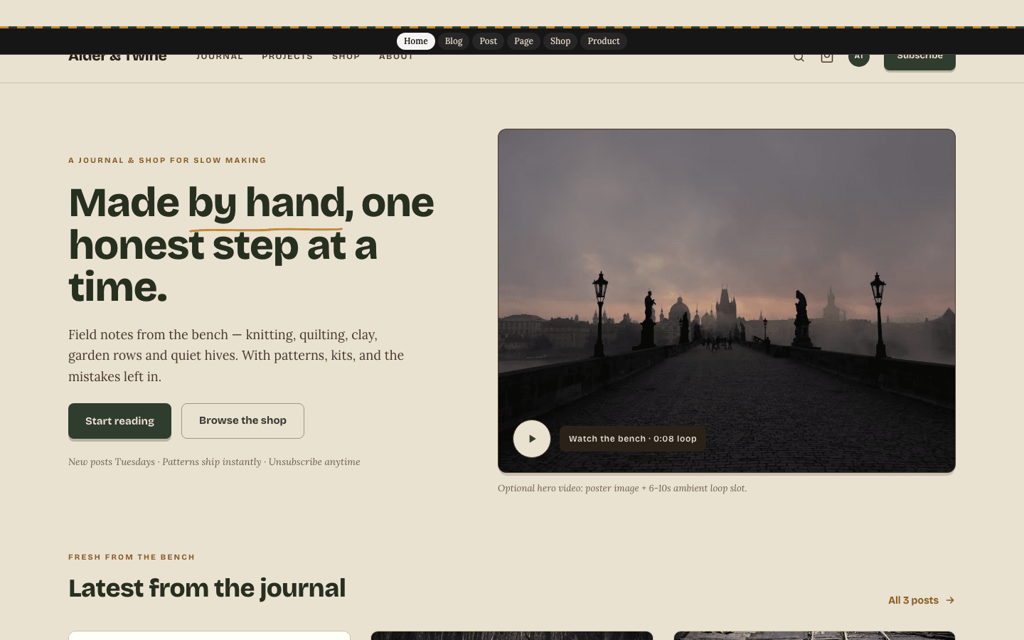
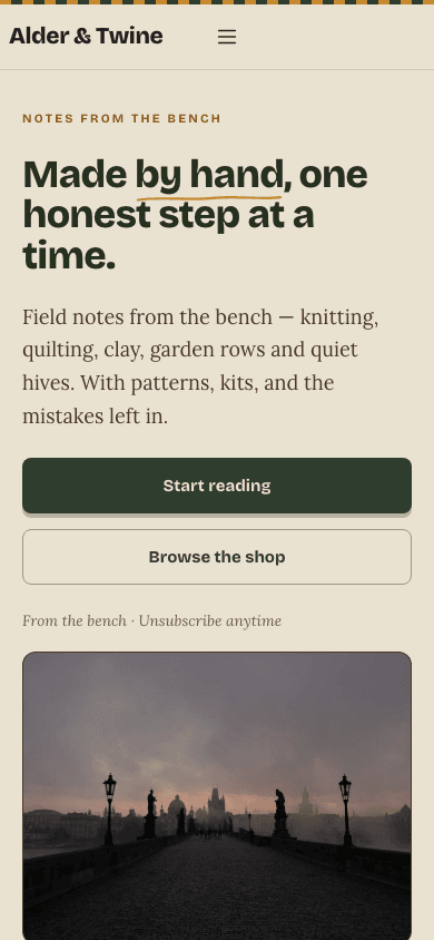
Workbench gives a craft blog the feel of a well-kept project notebook. Headings are set in Bricolage Grotesque and body text in Lora, on bone paper broken up by forest-green bands and amber accents. A woven selvage stripe runs along the header, key words wear a hand-drawn underline, and the home page opens on your own photograph before a row of recent posts.
Who it's for
It suits people who make things and write down how they did it: knitters and crocheters, quilters, potters, gardeners and beekeepers who publish patterns, project logs and the odd kit. A journal with a modest shop attached is exactly its shape, so someone selling PDF patterns or a few finished pieces needs nothing extra. It is a poor match for a stark technical or corporate brand, because the paper tone, rounded cards and handmade underline give every page a warm, crafted voice.
What makes it different
A hero that leads with your photograph
The home page opens on two columns. One holds a small eyebrow line, a large headline, your site description and two buttons, Start reading and Browse the shop. Until you write a description the headline is a sample line with an amber hand-drawn underline. The other holds your hero image, or the latest post's cover.
An optional workshop clip, poster first
Paste a video address into the Scroll journey field under Hero media in General settings and a muted, looping clip plays over the photograph. Skip the field and the still photograph carries the page alone. Anyone with reduced motion switched on in their system gets the photograph; the clip is hidden from them.
A journal grid and a project band
Below the hero, three recent posts appear as cards with a topic chip, date, excerpt and reading time. A forest-green band follows, headed From the project bench, listing up to three of your categories as cards that open the matching post list.
Entries on a calm narrow page
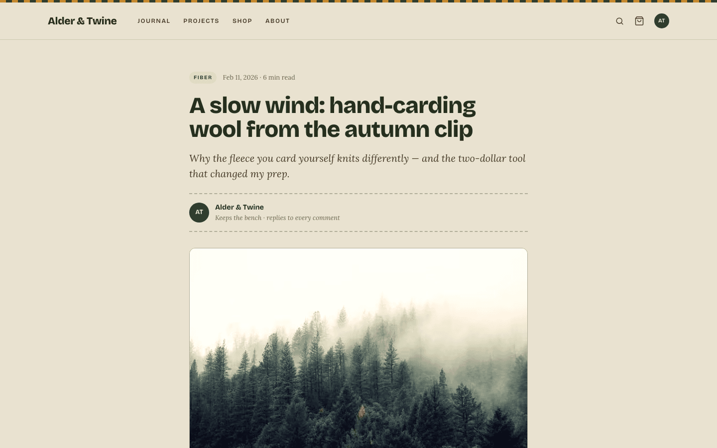
A post sits in a 680-pixel reading column with a chip, date and reading time above a large headline and an italic excerpt. A round initials badge introduces the author, the cover photograph follows, tags print as hashtag links and comments sit below. A forest-green newsletter panel ends the page whenever signup is active.
A small shop in the same hand
Under a short heading and a count line come category pills, then three cards per row. A dark category chip sits on each picture, with the price and a brief stock note beneath, and a second photo fades in under the cursor. Products without options show an add-to-cart button once a payment method is live.
Product pages with a buy-now option
A product shows a breadcrumb, a main picture with up to four thumbnails, the price, the description and an Add to cart button. Once Stripe is connected an amber purchase button joins it. Your feature list prints under About this product, set off by a dashed rule.
Page by page
- Home
- Photograph hero with a large headline, three journal cards, a forest project band and a footer of up to four columns.
- Blog
- The Journal masthead with a post-count line, up to eight category pills beside All, cards in three columns and numbered pagination.
- Post
- Narrow reading column, initials byline, framed cover photograph, hashtag tags, comments and a forest signup box.
- Page
- Eyebrow, heading, an italic intro closed by a dashed rule and a plain prose column.
- Shop
- Count line, pill filters and a card grid with second photos on hover.
- Product
- Breadcrumb, thumbnail gallery, price, buy buttons and a dashed feature panel.
Customizing it
Apply Global Design and your chosen background, text and primary colours take the place of bone, ink and forest, your accent colour stands in for amber, and your own heading and body fonts displace Bricolage Grotesque and Lora. Twenty strings of default wording, covering the hero eyebrow, footer tagline, login-page label and more, are editable in both English and Arabic from Theme copy in General settings.
Honest limits
- Single palette: bone paper and ink throughout, with no dark variant and no reaction to the visitor's colour-scheme setting.
- The header magnifier opens the site's plain post-search page. Neither the blog index nor the shop has its own search field, and the shop cannot be filtered by price or availability.
- Some shop and product wording is fixed in English: Made or chosen at this bench, All goods, the count line that ends sorted newest first, and the message shown while payments are not set up.
- The stock note on shop cards depends on product type, not inventory. Digital items read instant download and everything else reads in stock; sold-out status appears only on the product page.
- When your site has no description, the footer tagline and a few headings fall back to sample craft wording, including a line about a bench in the Pacific Northwest, until you rewrite them.
- Card paper, the code-block background and the faint dashed rules keep fixed colours whatever Global Design says.
Specifications
- Category
- Animation
- Price
- Included
- Plan availability
- Included in every VeloCMS plan
- Commerce-ready
- Yes
- Motion
- Yes
Frequently asked questions
Do I need a video for the hero?
No. A photograph completes the hero, drawn from your hero image or your latest post. The clip appears only after you add its address, and reduced-motion visitors never see it.
Can I replace the craft wording with my own?
Yes. Twenty text slots, among them the hero eyebrow, the project-band heading and the newsletter box title, can be edited in both languages. Leave one blank to keep the original.
Does the menu support dropdowns?
Yes. A top-level link with children opens as a dropdown on desktop and as indented links under their parent inside the mobile drawer, which slides over the page and has its own close button.
Can I sell digital patterns as well as physical goods?
Yes. The shop lists both kinds. Digital items are noted as instant download, and a product without options gets an add-to-cart button once Stripe, PayPal or a comp purchase is available.
How is Workbench different from Workbench Motion?
They share the palette, fonts, journal and shop. Workbench keeps a still, two-column hero. Workbench Motion swaps it for a full-width scene that follows the visitor's scroll when you supply a clip.