Minimal Dark
The original VeloCMS dark theme: quiet, typographic, and happy to host a small shop.
Minimal Dark is where VeloCMS started: a near-black page, Inter set large, and a hero that is nothing but your blog name and one line about it. Three featured posts sit below, then an about teaser, then a subscribe card once signup is switched on. Nothing competes with the writing, and a shop is there when you need one.
Who it's for
Choose it when the writing is the product. Writers, indie makers and developers who want a calm dark blog without a gimmick will feel at home, and so will creators who sell a few digital or physical products next to their posts, because the shop and product pages share the same look. It is a weaker fit if you want a bright magazine front page or a loud visual identity. Curator suits that job better.
What makes it different
A hero that is just type
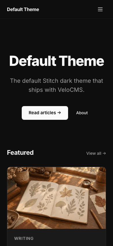
The hero has no image slot. Your blog name is the headline, your description sits beneath it, and a Read articles button leads into the blog, with an About button beside it once you have published an about page. The three newest posts follow as cards showing their first tag, date and reading time.
A blog index that scales
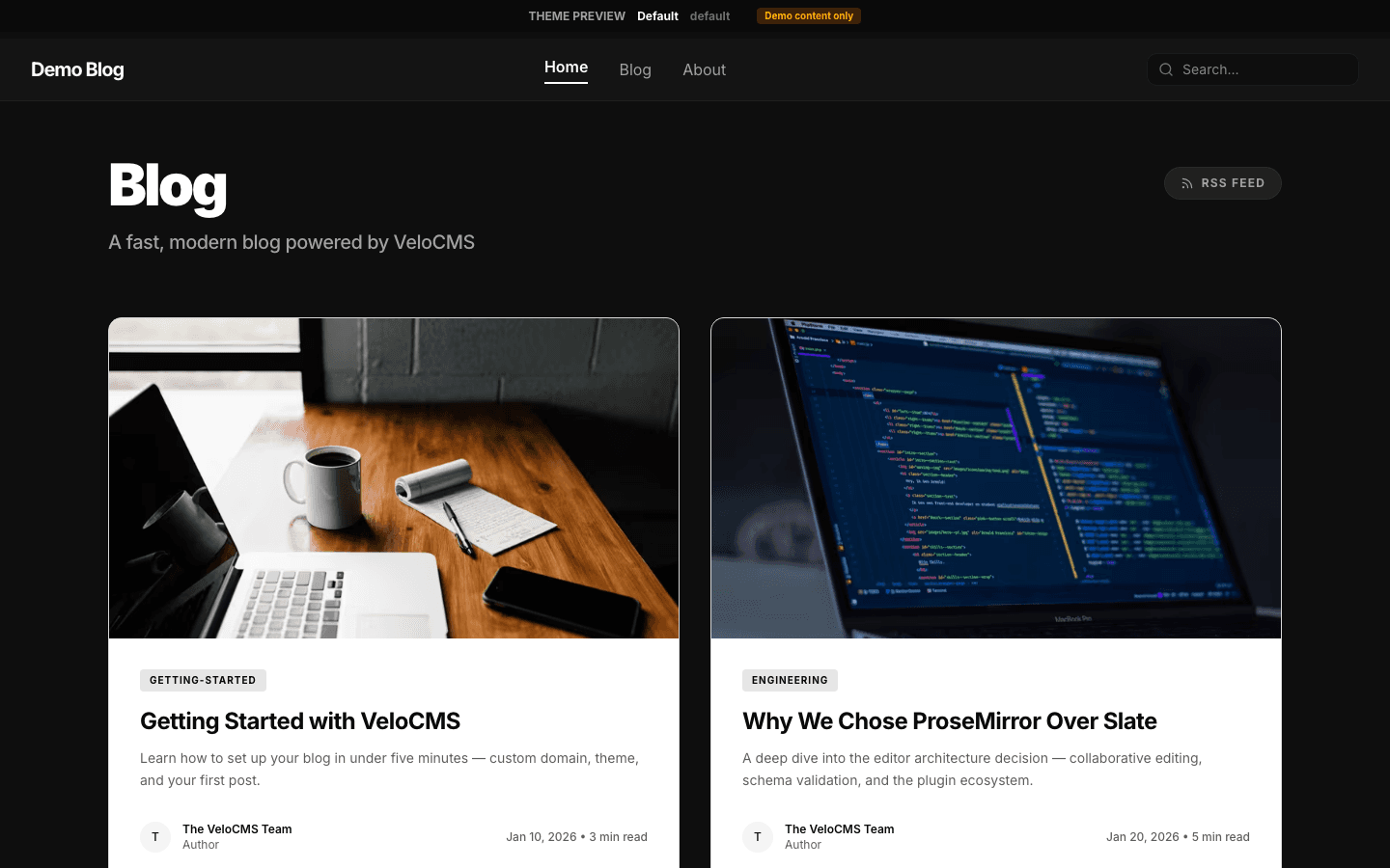
The blog index offers category filter pills, a search box and a three-column card grid. When the archive grows past one page, numbered pagination with a Next link keeps older posts reachable, and the category or tag you filtered by is carried across pages.
A post page built for reading
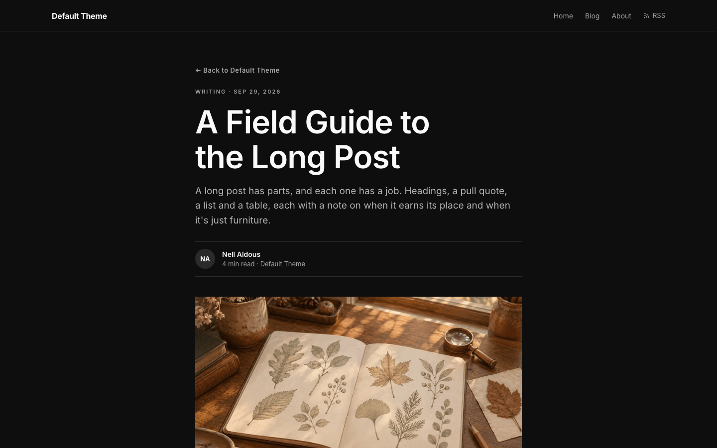
Posts open with a back link, a tag and date line, the headline and the excerpt as a standfirst. An author byline with initials, a cover image and the article body follow, then tag pills, a newsletter box and a comments section. The newsletter box only appears when a signup path is set up and the subscribe widget setting is on.
Its own shop layout
The shop has a layout of its own: a search box, category pills and a grid of product cards with the price on each. A card swaps to a second image on hover when the product has one, and products without options get an add-to-cart button once a payment method is connected.
Product pages with options
Product pages show a gallery with scrolling thumbnails, the price and an Add to cart button, plus a second buy button when Stripe checkout is connected. Products with options such as size or colour get a variant picker, and a sold-out product without options swaps the buy buttons for an out-of-stock label.
Menus that can nest
Give a menu item children and the desktop nav turns it into a dropdown, while the mobile drawer shows the same tree. Menus can go three levels deep. Until you build one, a new site gets Home and Blog links, plus Shop when it is set up to sell products.
Page by page
- Home
- Typographic hero, three featured posts, an about teaser, a subscribe card when signup is on, and a footer with resource and legal links.
- Blog
- Category pills, search, a card grid and numbered pagination.
- Post
- Byline, cover, tag pills, a newsletter box when subscribing is on, and comments.
- Page
- Page-builder content rendered inside the same nav and footer.
- Shop
- Search, category pills and product cards with an optional hover image.
- Product
- Gallery, price, variant picker and add-to-cart or buy buttons.
Customizing it
Colour and type are yours to change. In the Global Design panel under Appearance, set a palette and fonts, and with Apply my brand to the whole site theme switched on, Minimal Dark takes your background, text and accent colours and your font across the live blog. Corner radius is the one setting it ignores. Menus are edited under Navigation, and pages from the page builder render inside the same nav and footer.
Honest limits
- It is dark only. The CSS defines one near-black palette and does not follow the visitor's system colour setting.
- The home hero is typographic. A hero image from your settings is not used by this theme.
- The wording of fixed labels such as the hero button and the about link is part of the theme and cannot be edited from settings.
Specifications
- Category
- Minimal
- Price
- Free
- Plan availability
- Included in every VeloCMS plan
- Commerce-ready
- Yes
- Motion
- No
Good fit for
Frequently asked questions
Does Minimal Dark have a light mode?
No. Its styles define a single dark palette, with no light variant and no switch for the visitor's system setting. You can recolour it in Global Design, but the layout is drawn for a near-black page.
Can I sell products with Minimal Dark?
Yes. It ships its own shop and product page layouts in the same style as the blog, with search, category pills, variant pickers and add-to-cart buttons.
Why can't I see the subscribe box?
The theme hides it until two things are true: a way to subscribe is set up (paid membership, the built-in newsletter, or a connected Kit, Beehiiv or Mailchimp account) and the Show subscribe widget on blog setting is on. Then the home card, the footer link and the post box appear.
Can I use drop-down menus?
Yes. Menu items can have children, up to three levels deep. The theme shows them as a dropdown on desktop and as a tree in the mobile drawer.